

Before you even think about changing a color or tweaking a font, the most important decision you'll make is choosing your starting point. You're at a fork in the road: do you take a powerful, pre-built theme and make it your own, or do you commission a completely custom build from the ground up?
This single choice will shape your budget, your timeline, and your store's flexibility for years to come. It’s a big deal.
Choosing Your Shopify Customization Path
Deciding on your design approach isn't just about looks—it’s a core strategic decision. Whether you adapt an existing theme or build from scratch sets the tone for everything that follows. It's about finding that sweet spot where your brand's vision, technical needs, and business goals all line up.
For most brands, grabbing a theme from the Shopify Theme Store is the smartest move. This is especially true with the newer Online Store 2.0 themes, which give you an amazing amount of no-code flexibility right out of the box. You start with a professionally designed, mobile-friendly foundation that's already been checked for speed and security.
Pre-Built Themes: The Smart Default
There’s a good reason pre-built themes are so popular. They're fast, affordable, and get the job done well. Statistics show that the most popular themes are Trademark (used by 20.7% of stores), the default Dawn theme (9.1%), and Horizon (5.1%).
Brands lean on these because they’re reliable, get regular updates, and pack in features that work for all sorts of businesses. A great premium theme will usually set you back between $200 and $400 as a one-time purchase, which is a fantastic value for what you get.
The Shopify Theme Store is a massive marketplace where you can find something that fits your industry and catalog size perfectly.

It’s designed to help you find a starting point that already feels close to your brand’s aesthetic and has the core functionality you need.
When to Consider a Custom Build
So, when does a custom theme make sense? A custom build becomes essential when you have a specific vision for the user experience that no template can deliver. If you're dreaming up something truly unique or need to integrate with complex, proprietary backend systems, then going custom is your only real option.
This path gives you total creative freedom, but be prepared for a much higher price tag and a significantly longer development schedule.
Key Takeaway: A custom theme isn't just about looking different; it's a strategic investment for established brands with highly specific functional demands that standard e-commerce features simply can't meet.
This table breaks down the key differences to help you decide which path is right for your business.
Custom vs Pre-Built Shopify Themes at a Glance
| Feature | Pre-Built Theme | Custom Theme |
|---|---|---|
| Cost | $200 – $400 (one-time) | $10,000 – $100,000+ |
| Timeline | Days to weeks | Months |
| Flexibility | High (within theme settings) | Unlimited |
| Uniqueness | Low to moderate | Completely unique |
| Support | Theme developer & community | Your development agency/freelancer |
| Best For | New & growing businesses | Established brands with unique needs |
Ultimately, choosing a pre-built theme is the most practical route for the vast majority of store owners, offering a blend of professional design and accessible customization.
Part of this early-stage thinking also involves making sure you're on the right platform in the first place. It’s always smart to understand the landscape; for example, a quick Ecwid vs Shopify comparison can confirm you've chosen the ecosystem that best supports your long-term customization goals. It all comes down to finding the right balance between your vision and your resources.
Making an Impact with the Theme Editor (No Code Required)
The Shopify Theme Editor is your playground for making big visual changes without writing a single line of code. Don't mistake it for a simple color-picker. With modern Online Store 2.0 themes, it’s a full-blown, drag-and-drop page builder that puts you in the driver's seat of your store's entire look and feel.
This power comes from a simple but brilliant structure built on Sections and Blocks.
Think of your webpage like a stack of building blocks. Each major block is a Section—things like an "Image with Text" banner, a "Featured Collection," or a "Video" player. You can stack them, remove them, and shuffle them around to build the fundamental structure of any page.
Inside each of those big Sections, you have smaller pieces called Blocks. So, an "Image with Text" Section might have separate Blocks for the heading, the paragraph of text, and the call-to-action button. This gives you amazing control, letting you manage the overall page layout at a high level while also fine-tuning the details within each component.
Putting Sections and Blocks to Work
Let's get practical. Imagine you want to weave your brand story into the homepage. You don't need to hire a developer; you can build it yourself in just a few minutes.
You could start by adding a "Rich Text" section to introduce your mission. Right below that, maybe you drop in a "Video" section and embed a short film about your company's origins. To wrap it up, you could place a "Featured Product" section right underneath, pointing customers directly to your flagship item.
The best part? You can rearrange that entire story by just dragging the sections up or down in the editor's sidebar. It's all visual, intuitive, and instant.
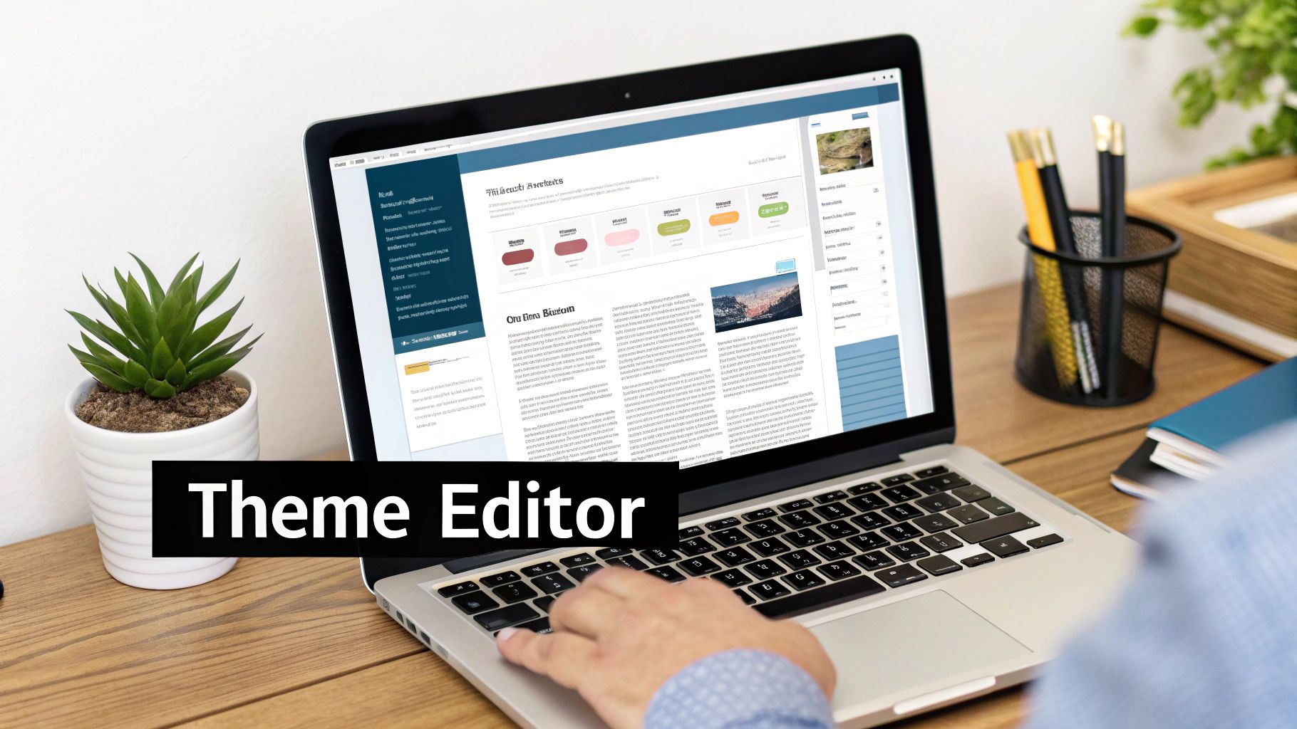
This interface is where the magic happens. You’re visually building your pages and seeing the results in real-time, which is a total game-changer for non-technical store owners.
Unify Your Brand in the Theme Settings
While Sections and Blocks handle the layout of individual pages, the Theme settings panel is where you dial in your brand's personality across the entire site. This is how you transform a generic template into something that’s unmistakably yours.
My Takeaway: Consistent branding isn't just about looking good; it's a huge trust signal. When your colors, fonts, and button styles are the same everywhere, customers see a professional, polished store they can feel confident buying from.
Changes you make here cascade across your whole website, creating a seamless experience.
Essential Theme Settings to Configure:
- Colors: Set your primary, secondary, and accent colors here. A good palette ensures every button, link, and background reinforces your brand without you having to touch them one by one.
- Typography: Choose the fonts for your headings and body text. Most modern themes tap into Shopify’s huge font library, so you can almost always find the perfect match for your brand guide.
- Social Media: This is where you plug in the links to your social profiles. The theme will automatically drop the icons in the right places, like the footer or header, so customers can connect with you.
For example, a boutique selling handcrafted leather goods could use a warm, earthy color palette and a classic serif font to give off a feeling of quality and tradition. You set that up once in Theme settings, and the entire store instantly adopts that visual identity. By mastering both the micro-control of Sections and the macro-impact of Theme settings, you can completely customize Shopify themes and build a truly powerful storefront.
Customizing Key Pages to Increase Conversions
A beautiful homepage makes a great first impression, but the real business of selling happens on your product, collection, and cart pages. These are the make-or-break moments where a customer decides to pull the trigger. When you're customizing a Shopify theme, focusing your time on these critical touchpoints is easily one of the smartest moves you can make.
Even small, thoughtful tweaks in these areas can completely change the user experience, guiding shoppers smoothly toward the checkout. It's all about removing friction right when it matters most.
Elevating the Product Page Experience
Think of your product page as your digital sales pitch. It has to answer every question, overcome every hesitation, and build enough trust for someone to click that "Add to Cart" button. Stock templates give you a starting point, but real conversion power comes from adding the details that tell a richer story.
This is where metafields become a game-changer. They let you add structured, specific information to your products that just doesn't fit in the standard description box.
How to Use Metafields on Product Pages:
- Care Instructions: If you sell apparel, you could add a metafield for "Washing Instructions" (e.g., "Machine wash cold, hang to dry") and pop it into its own dedicated tab.
- Material Sourcing: For a sustainable goods store, a "Sourced From" metafield can highlight ethical origins, like "Hand-woven in Peru."
- Technical Specs: Selling electronics? Create separate metafields for battery life, dimensions, and warranty, then display them in a clean, easy-to-read table.
Another big piece of the puzzle is building trust right at the moment of decision. Customers are naturally wary of giving payment info to a store they've never used before. This is where trust badges come in—they're a simple but powerful visual shorthand for security.
Just add a small section right below your "Add to Cart" button with icons for Visa, Mastercard, PayPal, and a seal like "SSL Secure Connection." Most modern themes have a "Trust badges" or "Icon with text" block ready for you to use.
Refining Collection Pages for Better Discovery
Your collection pages are your digital showrooms. Their main job is to help people find what they’re looking for without any hassle. If browsing feels like work, you've already lost them. That's why customizing your filtering and sorting options is so important.
Almost all Shopify themes offer basic filters for price or availability, but you can make them so much more useful. By using product tags or specialized apps, you can create filters that mirror how your ideal customers actually think and shop.
Examples of Better Filtering:
- Fashion Store: Let shoppers filter by size, color, style ("Bohemian," "Minimalist"), and even occasion ("Wedding Guest," "Workwear").
- Skincare Brand: Allow filtering by skin concern ("Acne-Prone," "Anti-Aging"), key ingredient ("Hyaluronic Acid," "Vitamin C"), or product type ("Serum," "Moisturizer").
Organizing these filters into a clean sidebar or dropdown menu turns a potentially messy collection into a powerful discovery tool. It directly influences how many products a shopper will see and consider. To go deeper on this, you can find more strategies for how to improve ecommerce conversion rates that build on these very ideas.
Optimizing the Cart for a Higher Average Order Value
The cart page isn't just a waiting room—it's your final opportunity to increase the order's value and make sure the checkout is dead simple. Two small customizations here can make a huge difference.
First, add a free shipping progress bar. This little visual shows customers exactly how close they are to a reward (e.g., "You're only $15 away from free shipping!"). It gamifies the experience and gives people a powerful nudge to add one more item, which is a fantastic way to boost your average order value (AOV). Many themes have this built-in, or you can find an app for it.
Expert Insight: The free shipping threshold is a powerful psychological anchor. Shoppers will consistently spend more to avoid paying for shipping, often adding items they didn't initially plan to buy just to get over that line.
Second, make sure you have cart notes enabled. It’s just a simple text box, but it allows customers to leave special instructions, like gift wrapping requests or delivery notes. If you sell anything that could be a gift, this is a must. It cuts down on customer service emails later and shows you’re paying attention to their needs, which always makes for a better experience. You can usually flip this on right in your theme's "Cart" or "Cart drawer" settings.
Making Safe and Simple Code Edits with Liquid and CSS
Sooner or later, you'll hit the limits of what the theme editor can do. That's when small, strategic code edits can give your store that final layer of brand-specific polish. I know diving into the code for the first time can feel a bit daunting, but it's a game-changing skill for anyone serious about customizing their Shopify theme.
The key is to go in with a clear plan and a safety-first mindset. We're not talking about complex programming here—just precise, targeted tweaks that make a big visual difference. But before you touch a single line of code, the most important rule is to always duplicate your theme. This creates a perfect backup you can restore in a click if anything goes sideways.
Understanding the Building Blocks of Your Theme
To make changes that actually work, you first need to know what you’re working with. Your Shopify theme is built on three core languages that all play nice together.
- HTML (Hypertext Markup Language): This is the skeleton. It lays out the fundamental structure and content of your pages—all the headings, paragraphs, and images.
- CSS (Cascading Style Sheets): This is the language of design. CSS controls every visual element you see, from colors and fonts to spacing and layouts. Most of your simple edits will happen right here.
- Liquid: This is Shopify’s own templating language. Think of it as the nervous system connecting your theme's HTML to your store’s data, pulling in dynamic content like product titles and prices.
I like to explain it like building a house: HTML is the frame, CSS is all the paint and interior design, and Liquid is the plumbing and electricity that makes it a functional home.
Pinpointing What to Change with Browser Tools
Instead of digging through files and guessing which one controls a button's color, you can use your browser’s built-in developer tools to get the exact answer. It’s like having an x-ray for your website.
On your live site, just right-click any element you want to change—a product title, a button, a section header—and select "Inspect." A panel will pop up, showing you the raw HTML structure on one side and the corresponding CSS styles on the other. As you hover over lines in the HTML, you'll see the element light up on the page.
This tool is a lifesaver because it tells you two crucial things:
- The specific CSS class or ID name of the element you want to change.
- Which CSS file contains the style rule (usually a file named something like
base.cssortheme.css).
This visual flow shows how different elements work together to guide a customer from discovering a product to completing a purchase.
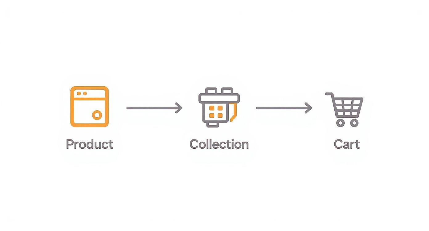
Understanding this pathway helps you decide which pages and elements need the most attention to create a truly seamless shopping experience.
Executing Your First Safe Code Edits
Okay, now that you know how to find what you want to change, let's walk through a common scenario. Imagine your theme's "Add to Cart" button is a shade of blue that clashes with your branding, and there's no option for it in the theme editor.
Using the "Inspect" tool, you discover its CSS class is .product-form__submit-button. Perfect. Now you know exactly what to look for. Just navigate to Online Store > Themes > Actions > Edit code, open your main CSS file, and search for that class. From there, you can change the background-color property to your brand's specific hex code.
Key Takeaway: The goal of simple code edits isn't to rewrite your theme. It's about overriding or tweaking small style rules that the theme editor doesn't give you access to.
This hands-on approach is becoming the norm. In fact, over 32.97% of Shopify stores are now using custom themes, showing a clear trend toward unique brand experiences. This shift is partly thanks to Shopify's own updates, which make themes more modular and easier for merchants to tailor to their exact needs. You can get more insights on how merchants are using theme customization on Shopify.com.
When you get comfortable with CSS edits, you'll find certain tools can speed up your workflow. For instance, a REM converter tool is super handy for managing font sizes and spacing units consistently. Making these kinds of precise, professional tweaks is how you truly take full control of your brand's visual identity.
Don't Let a Slow Store Kill Your Customizations
You've poured hours into getting your Shopify theme just right. But here's the hard truth: a gorgeous design means nothing if your site takes an eternity to load. Even a one-second delay can tank your conversions by as much as 7%. The final, crucial step after all that design work is to make sure your store is lightning-fast and looks great on every device.
Performance isn't just a technical detail; it's a huge part of the customer experience. All your effort can be completely wasted if slow load times and a clunky mobile view send potential buyers bouncing.

Think of this final polish as insurance for your hard work. It ensures your beautiful design actually helps you sell more instead of just frustrating visitors. Let’s walk through the key things you need to do to protect your store's speed and responsiveness.
Tame Your Media Files
Big, unoptimized images are almost always the main culprit behind a slow Shopify store. Those beautiful hero banners and crisp product photos you love? They can secretly be performance killers if they aren't handled correctly. The goal is to strike the perfect balance between visual quality and file size.
Always compress your images before you upload them. Tools like TinyPNG are great, and Shopify has its own compression built-in, but starting with an optimized file is best. You should also be serving images in next-gen formats like WebP, which gives you much better compression than old-school JPEGs and PNGs. While Shopify helps by automatically converting images for compatible browsers, it all starts with a high-quality, but reasonably sized, source file.
If you're sourcing a lot of product media, a tool like AliSave Pro can be a massive help here. It doesn't just grab all the images you need in one go; it also has compression features built-in. You can optimize everything before it even touches your media library, which really cleans up the workflow.
Audit Your App Overload
Apps are great for adding new features, but every single one you install adds scripts and code that can weigh down your site. Over time, it's easy to collect a graveyard of apps that are running in the background, even if you barely use them. This is like a hidden performance vampire, slowly draining your site's speed.
Make it a habit to do a ruthless app audit every few months.
- Go through your list of installed apps and ask yourself: "Is this feature absolutely essential for my business?"
- If an app is only doing something simple that a small code tweak could handle, you might be better off with the custom code.
- Get rid of anything that's disabled, redundant, or just not pulling its weight anymore.
This kind of digital decluttering can lead to some surprisingly big speed improvements. Every app you remove is one less script your visitors have to load. For a more structured approach, a good Shopify site speed optimization guide can walk you through finding and fixing these kinds of bottlenecks.
Test Like a Customer
You can't really know how your store performs if you only test it on your blazing-fast office Wi-Fi and powerful desktop. You have to experience your site the way your actual customers do.
Sure, you can use your browser's developer tools to simulate different network speeds and screen sizes. But don't stop there. Actually grab your phone, your partner's tablet, maybe even an older device if you have one lying around. Try to navigate your store as if you were a real shopper looking to buy something.
Pro Tip: The ultimate test is to go through the entire checkout process on a real phone using a cellular connection, not Wi-Fi. This is where you'll find all the frustrating layout issues or slow-loading elements that you'd otherwise completely miss.
This kind of hands-on testing is non-negotiable. It’s the only way to guarantee that the beautiful theme you've built provides a smooth, enjoyable experience for every single visitor. After all, that’s the foundation of a successful online store. If you're looking for inspiration on how the pros do it, check out examples of the best ecommerce website design to see how top brands nail this balance of looks and performance.
Got Questions? We've Got Answers
When you first start tweaking your Shopify theme, you're bound to run into a few common head-scratchers. Trust me, we’ve all been there. Getting a handle on these key issues early on will save you from some serious headaches and help you avoid rookie mistakes. Let's walk through some of the most frequent questions that come up.
Will Updating My Theme Erase All My Hard Work?
This is a big one, and the answer is: it depends. If you’ve configured settings using the theme editor—things like colors, fonts, and layout options—those are usually safe during an update.
But, if you’ve dug into the code and made direct changes to Liquid, CSS, or HTML files, a standard theme update will overwrite them. Poof, gone. That’s why you absolutely must keep a record of every single code change you make.
Expert Tip: For anything more than a tiny CSS tweak, the pros use a version control system like GitHub. This is the only reliable way to merge official theme updates with your custom code without losing your work.
What’s the Real Difference Between a Section and a Block?
Think of it like building with LEGOs. This is the foundation of Shopify's modern theme architecture, and it's a game-changer once you get it.
A Section is one of the big LEGO bricks. It's a major content area on your page, like the main hero banner, a featured product grid, or a testimonial slider. You can stack these sections, drag them around, and remove them to build the overall structure of your page.
A Block is a smaller LEGO piece that fits inside a Section. For example, your "Testimonial Slider" Section would contain individual "Testimonial" Blocks, each with its own quote and author. This lets you control the smaller details within a larger component.
This setup gives you the best of both worlds: broad control over the page layout and granular control over the content inside each part.
Help! How Do I Undo a Change I Made?
We’ve all had that heart-stopping moment. The good news is, Shopify has a built-in "undo" button for your code. If you’ve made a code edit you regret, just go to that specific theme file (like base.css), find the "Older versions" link, and you can roll back to a previous save point.
For changes you make in the theme editor, you can always just hit "discard" before saving. But the single best piece of advice I can give you is this: always, always duplicate your theme before you start making any significant changes. It creates a complete backup. If things go sideways, you can restore the old version in a single click. No stress.
Should I Use an App or Custom Code for a New Feature?
Ah, the classic debate: convenience vs. control.
An app from the Shopify App Store is usually your best bet for complex functionality. Think loyalty programs, advanced search filters, or subscription boxes. These are built, tested, and supported by professionals. The trade-off? Apps often come with a monthly fee and can sometimes add extra code that slows down your site.
Custom code, on the other hand, is perfect for smaller, specific design tweaks. Need a unique button style or want to adjust the spacing on your product page? A few lines of CSS are far more efficient. The rule of thumb is simple: for complex systems, a well-built app is the way to go. For targeted visual changes, custom code is lighter and faster.
Ready to stop wasting hours gathering product media? The AliSave Pro Chrome extension is your new best friend. It lets you download all AliExpress product media—high-res images, variant photos, and videos—in a single click. Download AliSave Pro for free and make your life easier today!