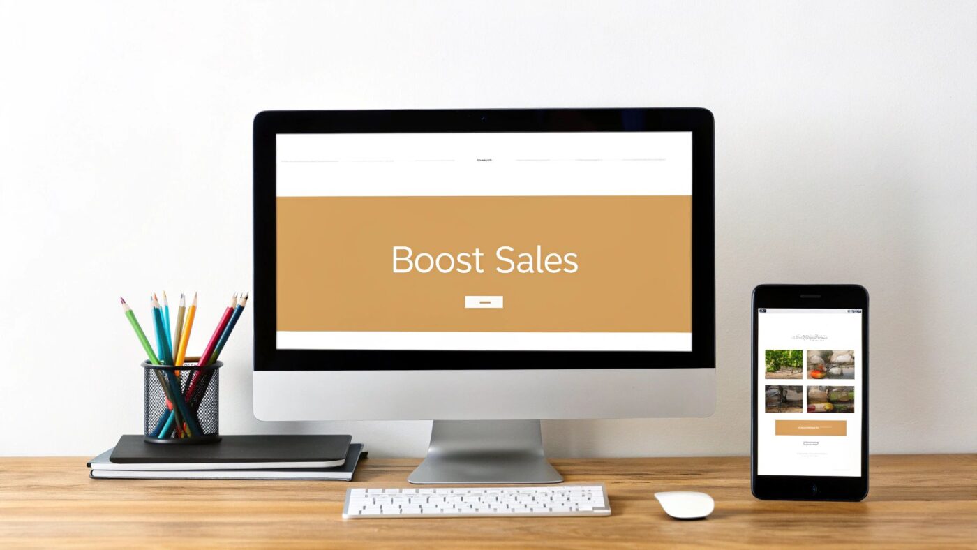
The best ecommerce website design is far more than just a pretty face. It’s a carefully crafted blend of visual appeal, dead-simple usability, and rock-solid technical performance. The ultimate goal? To seamlessly guide a curious visitor from the moment they land on your site to the final click of the "buy" button.
A great design works just like your best salesperson—it’s persuasive, helpful, and makes the entire buying process feel effortless.
What Makes a Great Ecommerce Website Design
Think of your online store as your flagship digital location. Just like a physical retail shop, the layout, flow, and overall atmosphere have a massive impact on whether someone sticks around or walks right back out. A cluttered, confusing, or slow-loading website is the digital equivalent of a messy store with flickering lights and no one at the counter. It kills the sale before it even starts.
With the global ecommerce market projected to smash past $7 trillion by 2025, the competition is fiercer than ever. In this climate, your website's design isn't just a "nice-to-have"; it's a critical business asset. Consider this: 94% of a visitor's first impression is tied directly to your site's design. If it's bad, you've lost them. Poor navigation alone will make 38% of people leave, while a fantastic user experience can rocket your conversion rates by up to 400%. The return on good design is impossible to ignore.
This infographic neatly summarizes the core idea into its three most important parts: User Experience, Performance, and Trust.
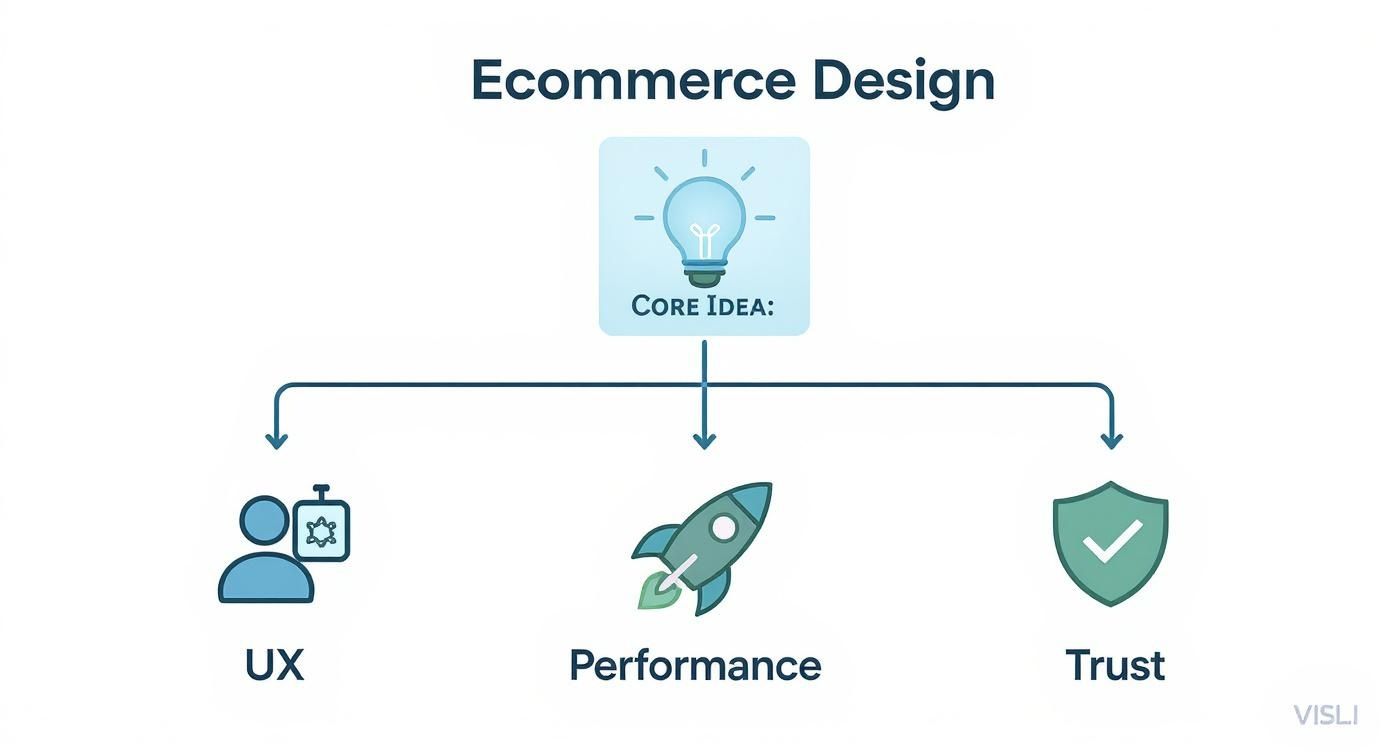
As you can see, a winning ecommerce site isn't built on just one of these elements. It’s the sweet spot where all three overlap and work together in harmony.
To give you a clearer picture of what we'll be covering, here’s a quick overview of these foundational pillars.
Core Pillars of High-Converting Ecommerce Design
| Pillar | Key Focus | Impact on Business |
|---|---|---|
| User Experience (UX) | Making the site intuitive, easy to navigate, and pleasant to use on any device. | Reduces bounce rates, increases time on site, and makes it easier for customers to find and buy products. |
| Performance & Speed | Ensuring pages load quickly and the site functions without glitches or lag. | Improves search engine rankings (SEO), keeps impatient users engaged, and directly boosts conversion rates. |
| Trust & Credibility | Communicating security, reliability, and authenticity to the shopper. | Encourages customers to share personal and payment information, fostering loyalty and repeat business. |
Getting these three areas right is what separates a thriving online store from one that just limps along.
The Three Pillars of Success
If you want to build a store that doesn't just attract traffic but consistently turns that traffic into sales, you have to master these three fundamentals. Nail these, and you'll transform your website from a simple product catalog into a powerful, automated sales engine.
Exceptional User Experience (UX): This is all about the feel of your website. Can people find what they’re looking for without thinking too hard? This covers everything from a logical navigation menu and clear product categories to a design that looks and works great on a smartphone.
Blazing-Fast Performance: Speed is a feature, not an afterthought. A slow website is a frustrating website, and that frustration costs you money and hurts your Google rankings. Every single second matters. Optimizing your images, code, and hosting is non-negotiable for keeping customers on your site.
Unshakeable Trust and Credibility: No one is going to type their credit card number into a website that looks sketchy. Trust is built through a professional design, prominent security seals, authentic customer reviews, and crystal-clear policies for things like shipping and returns.
Your website's design is the silent ambassador for your brand. It communicates quality, reliability, and professionalism before a visitor reads a single word. Neglecting it is like sending your top salesperson to a major client meeting in a stained t-shirt.
Throughout the rest of this guide, we’re going to get our hands dirty and dive deep into each of these pillars. I’ll show you practical strategies and real-world examples to help you structure your navigation, optimize your product pages, and build the kind of trust that turns casual browsers into lifelong customers.
Building a Foundation with Core Design Principles
Ever walked into a cluttered, disorganized store? You can't find anything, the aisles are a mess, and you leave feeling frustrated. Your website can create that same feeling if you ignore the fundamentals of good design.
The best ecommerce websites are like a perfectly organized boutique. Everything is exactly where you expect it to be. Clear signs guide you, products are beautifully displayed, and the path to the checkout is effortless. This isn't an accident; it's the result of applying core design principles.
Think of these principles as the blueprint for your online store. They’re the invisible structure that supports a fantastic customer experience, turning casual browsers into loyal buyers. Getting them right is the difference between a store that just looks pretty and one that actually sells.
Create a Clear Visual Hierarchy
Visual hierarchy is all about telling your customer's eyes where to look, and in what order. It's the art of making the important stuff stand out. Without it, your page is just a wall of text and images, leaving shoppers confused about what to do next.
Imagine a product page where the "Add to Cart" button is the same size, color, and font as the product description. It gets lost in the noise. A strong hierarchy uses visual cues like size, color, and placement to create a clear path for the user’s gaze, guiding them straight to the most important actions.
- Size Matters: Bigger elements feel more important. Your main headline and key call-to-action (CTA) buttons should always be more prominent than the surrounding text.
- Color and Contrast: A vibrant, high-contrast color for your "Buy Now" button makes it impossible to miss. This simple tweak can have a massive impact on your click-through rates.
- Strategic Placement: We're trained to read top-to-bottom and left-to-right. Placing key elements along this natural scanning path (often called an "F-pattern") makes your site feel instantly intuitive.
A well-designed visual hierarchy doesn't just make your site look better—it actively reduces cognitive load. It makes the decision-making process for your customers simpler and faster, which is always the goal in ecommerce.
By mastering this, you create a smooth, predictable path for your visitors to follow, leading them naturally toward the checkout.
Master the Art of Whitespace
Whitespace—or negative space—is the empty area around the elements on your page. New store owners often see it as wasted real estate, trying to cram as much as possible into every pixel. This is a huge mistake.
In reality, whitespace is one of your most powerful design tools. It gives your content room to breathe.
A cluttered page is overwhelming. It makes it hard for a customer to focus on what really matters: your products. Whitespace declutters the entire experience, improves readability, and gives your brand a more premium, sophisticated feel. In fact, studies have shown that good use of whitespace can increase user comprehension by nearly 20%.
The ecommerce platform you choose plays a big role in how easily you can control these design elements. Some have rigid templates, while others offer more creative freedom. If you're weighing your options, our guide on the best ecommerce platform can help you find a foundation that lets you build a beautifully designed store from the start.
Develop Intuitive and Simple Navigation
Your website's navigation is its roadmap. If that map is confusing, your customers will get lost, frustrated, and hit the back button. Great navigation should be so simple and predictable that users don't even have to think about it. They should just know how to find your "Men's T-Shirts" category.
Bad navigation is one of the top reasons people abandon a site. Your goal should be a structure so efficient that a customer can get to any product in three clicks or less.
Navigation Best Practices to Implement
- Use Clear Labels: Don't get clever with category names. Stick to universally understood terms like "Shop," "New Arrivals," or "Contact Us."
- Organize Logically: Group your products into categories that make sense to your customers, not just your internal team. If you're unsure, ask a few potential customers to sort your products for you.
- Include a Search Bar: For any store with more than a handful of products, a prominent search bar is non-negotiable. It’s the ultimate shortcut for shoppers who know exactly what they want.
The ultimate goal is to make finding products an unconscious process. When navigation is done right, people don't even notice it—they just find what they're looking for and check out. That's the hallmark of brilliant ecommerce design.
Winning with a Mobile-First Design Strategy

It wasn't long ago that we designed ecommerce sites for big, beautiful desktop monitors. The mobile version was just an afterthought—a shrunken, often clumsy version of the "real" website. That thinking is now a guaranteed way to lose customers.
Today, your shopper is just as likely to be browsing from their phone on the couch as they are from a computer at a desk. This is why a mobile-first design strategy isn't just a good idea; it's essential. Instead of designing for a large screen and then trying to cram it all onto a small one, you start with the mobile experience and build your way up. This forces you to focus on what’s truly important, ensuring the core shopping journey is perfect on the device people use most.
Think of it like building a house. A mobile-first approach is like designing a sleek, efficient tiny home first. Every square inch has a purpose. Only after you've perfected that core living space do you add the extra rooms and luxuries for the mansion—the desktop version. The foundation is already solid.
This shift is a direct response to how people shop now. Mobile devices generate over half of all global web traffic. Retailers who ignore this pay a steep price, with slow mobile sites costing the industry an estimated $2.6 billion in lost sales every year. With responsive design now standard on 90% of websites, a seamless mobile experience is no longer a bonus; it's the baseline expectation. You can see more data on this by checking out this in-depth research on web design standards.
Mobile-Friendly vs. Mobile-First
It's easy to confuse "mobile-friendly" with "mobile-first," but they're worlds apart. Understanding the difference is key.
- Mobile-Friendly: This is a reactive approach. A desktop site is built first, and then extra code is slapped on to make it shrink and rearrange on smaller screens. Sure, it works on a phone, but it often feels awkward, with tiny text and buttons that are impossible to tap accurately.
- Mobile-First: This is a proactive strategy. You begin the entire design process by thinking about the mobile user. Navigation, content, and calls-to-action are all planned for a small touchscreen right from the start.
A mobile-friendly site is like a movie with subtitles; you can follow the plot, but it’s not a native experience. A mobile-first site is like watching a movie filmed in your own language—it just feels natural.
Practical Tips for a Superior Mobile Experience
A fantastic mobile design comes down to empathy. You have to put yourself in the shoes of someone on the go, likely distracted, with less screen space and only their thumbs to guide them.
The best mobile designs are invisible. They get out of the way and let the user accomplish their goal—finding and buying a product—with zero friction. The experience should feel so natural that the customer forgets they are even using a device.
Here are a few practical techniques to get you there:
- Make Buttons Thumb-Friendly: A thumb is a lot less precise than a mouse cursor. Design your buttons and links with large tap targets so users don't get frustrated by hitting the wrong thing.
- Simplify Your Navigation: That giant, complex menu that looks great on a desktop is a disaster on mobile. Opt for a clean, collapsible "hamburger" menu and only feature your most critical categories.
- Crush Your Image Sizes: Large, unoptimized images are the number one killer of mobile page speed. Use tools to compress your product photos without a noticeable drop in quality. This is absolutely critical for shoppers on slower cellular data.
- Feature One Clear CTA: On your product pages, the "Add to Cart" button should be the star of the show. Use a bold, contrasting color and make sure it’s always visible, even as the user scrolls.
- Think in a Single Column: Mobile users are hardwired to scroll vertically. Design your pages to flow in one logical column. Avoid complex, multi-column layouts that force users to pinch and zoom.
When you adopt a mobile-first mindset, you’re not just designing for a portion of your audience; you’re designing for the modern majority. This focus is a cornerstone of great ecommerce design and is your ticket to providing a fast, intuitive, and profitable shopping experience, no matter where your customers are.
Designing Product Pages That Convert

If your website is the digital storefront, your product page is the final sales pitch. This is the moment of truth where a casual browser decides to become a paying customer. All the clever navigation and responsive design in the world mean nothing if your product pages don't seal the deal.
Think of it as a conversation. A customer showed interest by clicking. Now it's your job to answer their questions, calm their doubts, and get them genuinely excited about the purchase. A great product page doesn't just list facts; it tells a story, builds trust, and makes that "Add to Cart" button an obvious, irresistible next step.
Getting this right is a delicate mix of art and science. It demands stunning visuals that let the product be the hero, compelling copy that speaks directly to the customer's needs, and a heavy dose of social proof to close the sale.
Captivate with High-Quality Imagery
Online, you can’t touch, feel, or try on a product. This reality makes your product photography the single most critical element on the page. Low-quality, blurry, or just plain not enough images are an instant deal-breaker, immediately signaling a low-quality brand.
High-resolution images aren't a luxury; they're a requirement. Customers expect to zoom in and inspect every last detail, from the stitching on a handbag to the texture of a face cream. Your visuals have to bridge the gap between the digital and the physical, giving shoppers the confidence they need to click "buy."
To create a truly immersive experience, you need a variety of shots:
- Studio Shots: These are your clean, no-nonsense photos on a white or neutral background. They highlight the product itself without any distractions.
- Lifestyle Photos: Show your product being used in a real-world context. This helps customers visualize it in their own lives, turning an abstract item into a tangible solution.
- Detailed Close-Ups: Get up close and personal. Capture the small, high-quality features that set your product apart from the competition.
- 360-Degree Views or Video: For more complex items, a video demonstration or a 360-degree view can answer a dozen questions in just a few seconds and seriously boost conversions.
Your product photos are your digital brand ambassadors. They do the heavy lifting of demonstrating value, quality, and desirability long before a customer reads a single word of your description.
For dropshippers, manually saving all these essential images from supplier sites like AliExpress is a massive time-sink. This is exactly where a tool like AliSave Pro becomes a game-changer. It allows you to download all product and review images in a single click, preserving their quality and organizing them for immediate use.
Write Descriptions That Sell Benefits, Not Just Features
Once your stunning images have grabbed a shopper’s attention, your product description has to hold it. A classic mistake is to simply list features—the "what." Truly effective copy focuses on the benefits—the "why" that actually matters to your customer.
Don’t just say a backpack has "water-resistant nylon." Instead, say it "keeps your laptop and books safe and dry during a rainy commute." The first is a technical feature; the second is a benefit that solves a real-world problem.
Structure your descriptions so they're easy to scan:
- Use bullet points to call out the most important benefits.
- Keep your sentences short and punchy.
- Break up text with bolding or subheadings.
- Tell a mini-story that connects the product to the customer’s goals or aspirations.
Your mission is to paint a vivid picture of how this product will make the customer's life better. Make them feel the positive outcome of owning it.
Build Trust with Social Proof
Here’s a simple truth: shoppers trust other shoppers far more than they'll ever trust a brand. That’s the power of social proof, and it's one of the most effective conversion tools you have. A product page without reviews feels empty, unproven, and frankly, a bit risky.
By integrating social proof directly onto your product pages, you build instant credibility. The data doesn't lie: products with reviews have dramatically higher conversion rates. In fact, having just five reviews can increase the likelihood of a purchase by a staggering 270% compared to a product with zero reviews.
Key Forms of Social Proof to Include:
- Customer Ratings and Reviews: Display star ratings right near the product title where they can't be missed. And don't be afraid of imperfection—a 4.8-star average often looks more authentic than a flawless 5.0.
- Testimonials: Pull the most powerful quotes from your best reviews and feature them as visually distinct callouts.
- User-Generated Content (UGC): Encourage your customers to share photos of themselves using your products. These real-world images are often more persuasive than even the most polished professional shots.
Placing these trust-builders near the "Add to Cart" button can be the final nudge a hesitant shopper needs. Your product page is the moment of truth, and for anyone serious about turning interest into revenue, mastering the art of creating product pages that sell is absolutely essential.
Boosting Conversions with Speed and Trust

You could have the most beautifully designed e-commerce site on the planet, but if it’s slow or feels sketchy, it’s dead in the water. Speed and trust are the invisible forces that truly drive sales. They operate behind the scenes, either making a customer’s journey smooth and reassuring or creating enough friction to send them running to a competitor.
Think about it like walking into a physical store. If the lights are flickering and there are no employees in sight, you're not likely to stick around, let alone buy something. That’s the exact feeling a lack of online trust signals creates. Now, imagine a huge, slow-moving line just to get through the front door. You'd give up, right? That's what a slow website does to your potential customers.
Building an Unbreakable Foundation of Trust
Trust isn't a feature you can just switch on; you have to earn it with every single element on your site. For a shopper, typing in their credit card details online always requires a small leap of faith. Your job is to make that leap feel more like a tiny, secure step. The best designs weave trust signals so seamlessly into the experience that customers feel confident without even consciously thinking about why.
A trustworthy website feels like a firm handshake. It communicates professionalism, reliability, and a genuine commitment to the customer, turning a potentially anxious transaction into a confident purchase.
Think of these signals as the digital version of a clean, well-lit shop with helpful, visible staff.
- Show Off Security Badges: Don't hide your SSL certificate or trusted payment logos like Visa or PayPal. Display these badges prominently in your footer and on the checkout page. They’re constant, silent reassurances.
- Make Policies Crystal Clear: Your shipping and return policies need to be ridiculously easy to find and even easier to understand. A generous, transparent return policy can actually boost sales because it removes the risk for the buyer.
- Prove You're Real People: An "About Us" page telling your story and a "Contact Us" page with an address or phone number shows there’s a real, accountable business on the other side of the screen.
- Let Your Customers Do the Talking: As we've touched on, social proof is king. Customer reviews, ratings, and testimonials are your most powerful trust-building assets because they come from real people.
Getting these elements right is crucial for persuading visitors to become customers. To really dig into how design choices influence sales, you need to understand the fundamentals of Conversion Rate Optimization.
Optimizing for Speed: The Ultimate Conversion Booster
In e-commerce, speed is money. It’s that simple. Today’s shoppers have zero patience, and even the smallest delay can torpedo your sales. Research has shown that just a one-second delay in page load time can slash mobile conversion rates by up to 20%. This isn’t a small hiccup; it’s a massive hole in your sales funnel.
A slow site doesn't just frustrate people—it also makes you look unprofessional. The good news is, you don’t need to be a coding genius to see major improvements.
Simple Steps for a Faster Website
- Shrink Your Images: Huge, unoptimized images are the #1 cause of slow e-commerce sites. Use tools to compress their file size without making them look pixelated. This is absolutely critical for product pages, which are often loaded with high-res photos.
- Use a Content Delivery Network (CDN): Think of a CDN as a network of mini-servers that store copies of your site around the globe. When a customer from another country visits, your site is delivered from the server closest to them, making everything load way faster.
- Trim Down Your Apps and Plugins: Apps can add fantastic features, but each one adds a little bit of weight to your site. Do a regular audit and get rid of any you aren't using or that aren't absolutely essential for business.
Nailing these basics won't just create a better experience for your shoppers; it will also give you a boost in search engine rankings. Mastering site performance is a non-negotiable step if you want to learn how to improve ecommerce conversion rates.
Designing a Frictionless Checkout Experience
This is it—the moment of truth. The checkout process is the final step in your customer's journey, the digital equivalent of them standing at the cash register with their wallet out. If this part is long, confusing, or full of surprises, you'll lose the sale. This is why a frictionless checkout isn't just a nice-to-have; it's a cornerstone of great ecommerce design.
Think of an ideal checkout like the express lane at the grocery store. It's built for one thing: speed. Every single field, button, and step needs to be ruthlessly optimized to get the customer from A to B as quickly and painlessly as humanly possible. Your job is to tear down any obstacle standing between your customer and that "complete purchase" button.
It shouldn't be a surprise that a clunky checkout absolutely demolishes conversion rates. The data is clear: an overly long or complicated process causes 17% of shoppers to abandon their carts. They were ready to buy, but the friction was just too much.
Streamline the Path to Purchase
To create a checkout that feels effortless, you have to be relentless about cutting out unnecessary steps. Every click you can remove, every form field you can eliminate, gets a customer that much closer to finishing their order.
- Offer Guest Checkout: Forcing someone to create an account is like putting a brick wall in front of the cash register. A guest checkout option respects their time and can give your conversions a serious boost.
- Use a Progress Indicator: A simple visual bar showing steps like "Shipping," "Payment," and "Confirm" is a game-changer. It manages expectations and makes the whole process feel shorter and more organized.
- Enable Autofill: Let the browser do the heavy lifting. Automatically filling in known information like names and addresses is a small touch that saves time and makes the whole experience smoother.
The best checkout design is almost invisible. It guides the customer so effortlessly that they complete the transaction without ever feeling like they’re doing work. It should be a simple, reassuring conclusion to their shopping experience.
Eliminate Surprises and Build Confidence
The final moment before payment is the worst possible time for unexpected costs or a confusing layout. Transparency and clarity are your best friends here, preventing that last-second hesitation and building trust when it matters most.
Key Elements for a Trustworthy Checkout
- Display All Costs Upfront: Never, ever surprise a customer with a high shipping cost on the final page. Be transparent about taxes, shipping, and any other fees right from the start.
- Provide Multiple Payment Options: People have their preferences. Offering a variety of methods—credit cards, PayPal, and accelerated options like Shop Pay or Google Pay—caters to everyone and adds a layer of credibility.
- Showcase Security Badges: Visibly displaying trust seals from security providers and familiar payment logos provides a powerful, last-minute visual cue that the transaction is safe.
A poorly designed checkout is a direct drain on your revenue. For a deeper dive into fixing this, our guide on how to reduce shopping cart abandonment offers practical strategies you can put into action today.
Frequently Asked Questions
Even with the best guide in hand, you’re bound to have questions pop up along the way. Let's tackle some of the most common ones we hear from merchants just starting out.
How Much Does an Ecommerce Website Cost?
This is the big question, and the honest answer is: it depends. The cost can swing wildly.
On one end, you could use a pre-made template on a platform like Shopify and get a solid site up for a few thousand dollars. On the other end, a fully custom build with unique features and branding can easily climb into the tens of thousands.
Think of it as an investment in your single most important sales tool. The final price tag comes down to the project's complexity, who you hire, and just how much custom work you need.
What Is the Most Important Design Element?
If I had to pick just one thing, it’s a tie between intuitive navigation and a mobile-first design. Everything else hinges on these two.
Think about it: if your customers can't find what they're looking for, or if the site is a mess on their phone, it doesn't matter how stunning your photos are. All that great product copy goes unread. A smooth, frustration-free experience is the bedrock of a site that actually converts visitors into customers.
How Long Does an Ecommerce Site Take to Build?
The timeline is just as variable as the cost. A simple site built on an existing theme could be ready to launch in as little as 4-6 weeks.
However, if you're going the custom route with bespoke features and design, you should plan for a much longer runway—typically anywhere from 3 to 6 months, and sometimes more. That timeframe covers everything from initial discovery and wireframing to the full design, development, and crucial testing phases.