
Getting your Facebook cover photo just right means working with a specific size: 851 pixels wide by 315 pixels tall. While that's the ideal dimension for the space, the real trick is understanding how Facebook displays it differently on desktops versus mobile phones.
To keep your cover looking sharp and professional on every device, you need to place all the important stuff—like your logo, text, or key product shots—in the central "safe zone."
Why Your Facebook Cover Photo Size Is So Important
Think of your Facebook cover photo as the giant billboard for your business page. It’s one of the very first things a visitor sees, and it sets the tone instantly.
If that first impression is a blurry, stretched, or poorly cropped image, it can immediately make your brand feel unprofessional. For an e-commerce store, a sloppy cover photo might suggest a lack of care, making potential customers think twice before buying from you. A crisp, perfectly framed image, on the other hand, builds trust and shows you pay attention to the details.
Turn Your Cover Photo into a Marketing Powerhouse
When you nail the dimensions, your cover photo becomes a free and powerful advertising tool. It’s the perfect spot to:
- Announce a sale: Feature a "20% Off" graphic without worrying that the promo code will be cut off for half your audience on their phones.
- Showcase a new product: Display your latest item with a high-quality image that fills the space beautifully and grabs attention.
- Guide your visitors: Add a clear call-to-action with an arrow pointing down to your "Shop Now" button, turning your cover into a direct sales driver.
Your cover photo is like the headline of your digital storefront. If it's messy or hard to read, people will just scroll past. A clean, optimized image invites them to come inside and look around.
This principle of using precise image dimensions for a professional look isn't just a Facebook thing. For example, getting the ideal image size for LinkedIn posts is just as critical for making a strong first impression in a professional context. Taking a few minutes to master these specs is a simple, high-impact way to elevate your brand's presence everywhere online.
Navigating the Desktop and Mobile Safe Zone
Ever upload a cover photo you've spent ages perfecting, only to pull up your Facebook page on your phone and find it looks completely broken? It’s a classic, frustrating moment. This happens because what looks perfect on a wide desktop monitor gets automatically cropped to fit a much narrower mobile screen.
The secret to avoiding this mess is designing for the mobile-safe zone. This is the central sweet spot of your image that’s guaranteed to be visible no matter what device someone is using. For a standard 851 x 315 pixel cover photo, this safe area is a column roughly 560 pixels wide right in the middle. Everything outside that zone is at risk of getting the chop.
Why the Safe Zone Matters
Forgetting about this safe zone can be a disaster, especially if you're running a business. Think about it: that crucial "20% Off" text or the main product you're featuring could be completely invisible to the 98% of users who are scrolling on their phones.
Your most important stuff—logo, tagline, call to action, or key visuals—absolutely must live within that central space.
A good rule of thumb I always follow is to design mobile-first. If your cover photo looks sharp and clear on a phone, it will almost always look fine on a desktop. The reverse, however, is rarely true and leads to awkward cropping for most of your audience.
I always recommend a simple "upload and check" workflow. It saves so much guesswork.
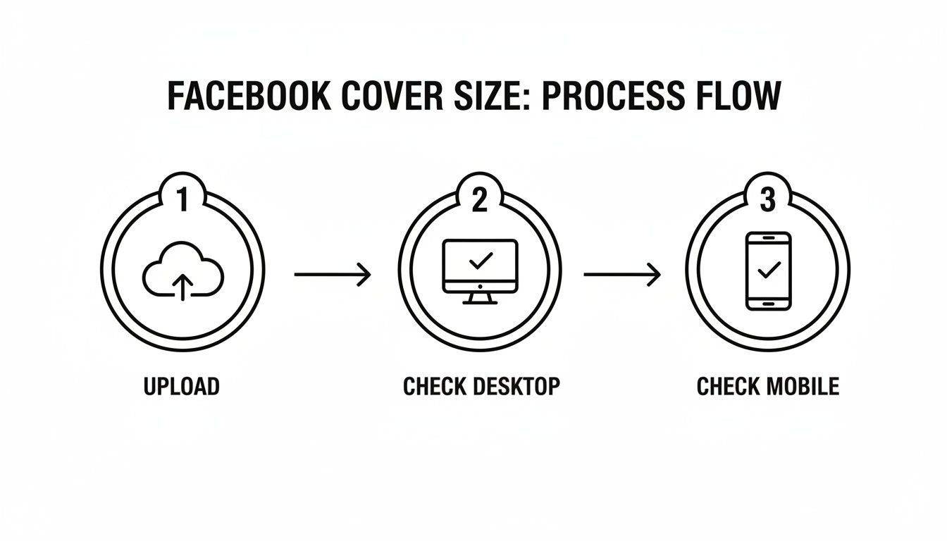
The process is straightforward: upload your design, then immediately check how it looks on both a desktop and a phone. This lets you catch any weird cropping issues right away.
This "smallest-screen-first" thinking isn't just for Facebook, either. It's a fundamental part of good design for any platform, from optimizing banner image sizes for different devices on your e-commerce store to knowing the right Instagram Reels format. Keeping these different viewing experiences in mind is how you build a consistently great-looking brand online.
Don't have fancy software? No problem. You don't need it to get your Facebook cover looking sharp. For anyone running a business, free online tools like Canva are a lifesaver. They take the guesswork out of the equation and let you create something professional in just a few minutes.
The real secret isn't in some complicated cropping technique. It’s about starting with the right canvas size before you even upload your photo. By creating a blank design with the perfect dimensions first, you’re in complete control and can guarantee a pixel-perfect result.
Nail the Setup in Canva
Getting this right in Canva is incredibly easy. Look for the option to create a design with custom dimensions. This is where you’ll plug in the magic numbers to sidestep any quality problems later on.
- Set the Width to 851 pixels.
- Set the Height to 315 pixels.
Using these exact dimensions is your best defense against Facebook's often aggressive, automatic compression. Once you have your blank canvas, just upload your product photo and drag it into place. This method lets you frame your subject exactly how you want it, giving you total command over the final look.
The biggest mistake I see people make is uploading a massive photo and just hoping Facebook figures it out. By creating a correctly sized canvas first, you dictate the final look and drastically reduce the risk of a blurry, awkwardly cropped mess. This one small shift in your workflow makes all the difference.
Why This Specific Size Still Matters
Facebook's official recommendations have changed a few times, but sticking with an 851 x 315 pixel upload is a tried-and-true best practice among marketers and shop owners. It’s known to prevent those strange visual glitches and artifacts that pop up when the platform tries to resize an image for you. In a crowded market, a poorly sized cover can hurt your brand's credibility, which is the last thing you want.
If you’re curious about the history and technical side of this, it's worth reading up on Facebook's evolving image specifications.
Need a Faster Fix? Try a Simple Resizer
Sometimes you don't need a full-blown design tool. You just need a quick crop and resize. For those moments, a simple web-based image resizer is your best friend. These no-frills tools let you upload your picture, punch in the dimensions (851 x 315 px), and download the adjusted file in seconds.
This is the perfect route when your photo's composition is already great and just needs a quick trim. No matter which tool you use, the final step is exporting a high-quality file. To learn more about that, check out our guide on how to optimize images for the web. Proper optimization ensures your cover photo loads fast and looks crisp—protecting that crucial first impression.
A Professional Workflow for Resizing in Photoshop
If you’re serious about getting your branding just right, Adobe Photoshop is the way to go. While the quick online tools are handy, Photoshop gives you pinpoint control and non-destructive editing, which is the secret to keeping your images sharp and professional.
This quick video will walk you through the entire process, from setting up your canvas to exporting the final image.
Let’s break down the key steps. The best way to start is by creating a new document with the perfect dimensions right from the get-go. Head over to File > New and punch in 851 pixels wide by 315 pixels tall. Starting with the correct canvas size prevents any weird stretching or quality loss later on.
Once your blank canvas is ready, the next move is to map out the safe zones. This is what truly separates a polished cover photo from one that looks broken on mobile.
Setting Up Your Safe Zone Guides
To make sure nothing important gets chopped off, you’ll want to create some visual guides. You can do this by going to View > New Guide and adding a couple of vertical lines. This creates a can't-miss visual box for your key content.
Here are the precise positions for your guides:
- Place one guide at 145 pixels from the left.
- Place another at 706 pixels from the left.
The area between these lines is your mobile-safe sweet spot, which is 561 pixels wide. Keep all your crucial elements—like logos, text, or faces—tucked neatly inside this zone. Anything outside of it will likely disappear on smartphones.
My biggest piece of advice: Before you do any resizing, right-click your image layer and choose "Convert to Smart Object." This is a non-negotiable step for me. It wraps your image in a protective container, letting you scale it up or down as much as you want without ever losing the original quality.
Exporting for the Web
You’ve got your image perfectly framed within the guides, so now it’s time to export it. This is where a lot of people go wrong. If you upload a massive file, Facebook will crush it with its own compression, and all your hard work will turn into a blurry mess. Your goal should always be to keep the final file size under 100KB.
The best tool for this is the legacy "Save for Web" dialog. Go to File > Export > Save for Web (Legacy). This menu is fantastic because it shows you a live preview of the quality and file size as you adjust the settings.
For most photos, a JPEG High preset at a quality of 60-70 is the perfect balance. If your cover is more graphic-heavy with sharp text or a logo, try PNG-24. Just keep a close eye on that file size. Nailing this final step ensures your cover photo looks crisp and loads instantly for everyone who visits your page.
Design Tips for a High-Impact Cover Photo
Getting the dimensions right is just the first step. Once you resize a picture for a Facebook cover, the real work begins—making it look great and actually work for your brand. A perfectly sized photo avoids awkward cropping, but it’s the design itself that grabs attention. Think of that space as prime real estate at the top of your page.
First thing's first: make sure people can read any text you add. If you’re including a tagline or a special offer, it needs to stand out. A simple trick is to place a semi-transparent dark overlay on a busy photo; this will make your white text pop instead of getting lost in the background.
Also, consider how you can direct your visitor’s attention. A subtle visual cue, like a person looking toward your call-to-action button or a product pointing that way, can be a surprisingly effective nudge.
Tell a Story with Your Visuals
Forget generic stock photos; they feel impersonal and do little to build trust. Instead, use high-quality, authentic images that show your product in a real-world setting. A photo of someone actually enjoying your product tells a much richer story than a sterile shot on a white background. It helps potential customers imagine it in their own lives.
For anyone in dropshipping, finding great product photos is a constant challenge. Knowing how to download images from websites correctly can give you a solid library of high-quality media to work with.
The most effective cover photos don't just show a product; they evoke a feeling. Aim for an image that communicates your brand's personality and connects emotionally with your target audience.
Finally, pay close attention to the file size. Try to keep your final image under 100KB. Facebook is notorious for aggressively compressing large photos, which can turn a sharp, beautiful design into a blurry mess. Exporting a smaller, optimized file from the start is the best way to preserve its quality. This has been a key detail ever since the cover photo was introduced way back in 2012 at 851 x 315 pixels. Understanding the specs is still just as crucial today.
Wrapping Up: Your Facebook Cover Questions Answered
So, you've resized your image and are ready to upload, but a few questions might still be bouncing around in your head. Getting these last few details ironed out is what separates a good cover photo from a great one. Let's tackle some of the most common snags people run into.
PNG or JPG: Which Format Is Best for a Facebook Cover?
This is a classic question, and the right answer really comes down to what's in your image.
Think of it this way: if your cover is a photograph with lots of rich colors and smooth gradients, JPG (or JPEG) is your go-to. It does a fantastic job of keeping the file size down without making the photo look bad.
On the other hand, if your design features crisp text, a sharp logo, or any graphics with hard edges, you absolutely want to use PNG. This format is lossless, meaning it won't create those fuzzy, pixelated artifacts around your text that can happen with JPG compression.
Why Does My Cover Photo Look So Blurry on Facebook?
If your cover looks blurry after you upload it, you can almost always blame Facebook's aggressive compression. When your image file is too large, Facebook squashes it down to save space, and that process can wreck the quality.
The secret to avoiding this is to get your file size under 100KB before you upload. Start with a high-quality image, resize it to the recommended 851 x 315 pixels, and then export it with that file size target in mind. This gives you control over the quality, not Facebook.
Can I Use a Video for My Facebook Cover?
Yes, and you absolutely should consider it! A video cover can be an incredible attention-grabber. Just make sure you stick to Facebook's rules to make it work.
Here are the key specs to remember:
- Dimensions: Your video should be at least 1250 x 462 pixels.
- Length: Keep it short and sweet, somewhere between 20 and 90 seconds.
- Safe Zone: Just like with static images, the video will be cropped on mobile, so keep the most important action centered.
Remember, videos usually autoplay on mute. Your visuals need to do all the heavy lifting to tell your story without any sound.
Sourcing great images and videos for your cover can be a real chore, especially when you're manually saving everything one by one. If you're using product media, a tool like AliSave Pro can be a lifesaver. It’s a free Chrome extension that downloads all product images and videos from an AliExpress listing in one click, giving you high-resolution assets instantly. You can get the extension from their website.