You’ve got a product photo ready, you tap Add to Story, and Instagram drops it onto a muddy default gradient that doesn’t match your store, your product, or anything else on your page. That’s where a lot of dropshippers lose polish. The product might be good, but the Story looks thrown together.
If you’re posting fast-moving offers, new arrivals, or simple product demos, knowing how to change background color on instagram story is one of the easiest upgrades you can make. It takes seconds inside the app, and it makes your Story look like marketing instead of a placeholder.
Table of Contents
- Why Custom Backgrounds Improve Your Instagram Stories
- The Quickest Way to a Solid Color Background
- Designing with Gradients in Instagram Create Mode
- How to Use a Photo for Your Story Background
- Advanced Tips for E-Commerce Story Design
- Frequently Asked Questions About Story Backgrounds
Why Custom Backgrounds Improve Your Instagram Stories
A customer taps into your Story, sees a sharp product photo, then gets hit with Instagram’s random auto-background. The item looks less premium in a second. That drop in perceived quality matters when you sell through Stories and need fast trust.

Instagram’s default background can work for casual reposts. It is usually weak for product selling. The app pulls colors from the image, but that does not mean the result matches your brand kit, keeps text readable, or makes the product stand out. For dropshipping stores, that mismatch shows up fast on sale announcements, restock slides, bundle offers, and UGC reposts.
The fix is simple. Use a background color on purpose.
A controlled background does three jobs at once. It keeps the product as the focal point, gives your price or CTA enough contrast to read quickly, and makes separate Stories feel like they came from the same store. That consistency matters more when you build product Stories from supplier images, because source photos often vary in lighting, crop, and color temperature. If you are pulling high-res product shots from tools like AliSave Pro, the native Instagram background tools are often the fastest way to turn those raw assets into something that looks store-ready without opening another editor.
Simple backgrounds usually sell better
Busy Story design is rarely the problem. Unfocused Story design is.
A single product cutout on a brand color often beats a flashy gradient with too many stickers. A beige background can make skincare look cleaner. A dark green fill can make a watch feel more premium. White can work well for gadgets and home products if the text and sticker colors are handled properly. The trade-off is straightforward. Plain backgrounds look more polished and read faster, but only if the color choice supports the product instead of washing it out.
If you want another practical walkthrough on how to change your Instagram Story background color, that guide is useful as a quick visual companion. If you’re also comparing native workflows with external editing options, this roundup of Instagram content tools and third-party apps helps clarify when you should stay inside Instagram and when it’s worth preparing assets in advance.
Practical rule: If the background gets noticed before the product, change it.
Why stores benefit more than creators
Creators can post a quick Story with mismatched colors and still get away with it because the audience is following the person. Stores do not get that margin for error. Buyers judge presentation fast. They use it to estimate product quality, pricing, and whether the shop feels legitimate enough to buy from.
Custom backgrounds help stores in three specific ways:
- Brand recognition: Repeating the same color family across promos, offers, and product drops makes your Stories easier to recognize.
- Readability: Controlled contrast makes pricing, shipping notes, and call-to-action text easier to scan.
- Product separation: The item looks cleaner when it sits on a chosen background instead of an awkward Instagram-generated blend.
For e-commerce teams, this is a workflow decision as much as a design one. A repeatable background style helps you publish faster, especially when you are turning supplier images into multiple Stories in one batch.
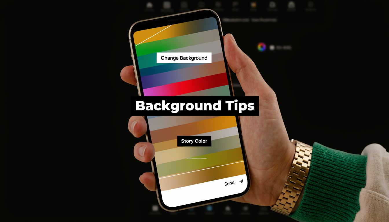
The Quickest Way to a Solid Color Background
The fastest method is still the best one for most product Stories. Use the Draw tool, fill the screen with one solid color, then place or reveal the product on top.

For product promos, countdowns, restock alerts, and “tap to shop” Stories, this is the workhorse method because it’s fast and doesn’t depend on outside apps.
Use the Draw tool the right way
The native workflow is straightforward:
- Open Instagram and start a new Story.
- Upload the image you want to work with.
- Tap the ellipsis menu, then tap Draw.
- Choose the pen tool.
- Pick a color from the default palette or use the eyedropper to sample a shade from the image.
- Press and hold on the screen for 2 to 3 seconds to flood-fill the background.
- Add the product back in with a photo sticker, or use the eraser if you want to reveal parts of the image.
According to Zeely’s walkthrough of the long-press method, this workflow has a 98% success rate on iOS and Android, takes an average of 10 to 20 seconds per Story, and the most common issue is accidental overshooting during the fill, which affects 25% of users.
That time savings matters when you’re building multiple Story frames for one product launch.
Where sellers usually mess it up
Most mistakes happen before the color fill, not after it.
- They choose a color that matches the product too closely. If the product blends into the background, the Story loses shape.
- They rely on the default palette only. The eyedropper is the better move when you need a tighter brand match.
- They fill first, then force the product into the layout. It’s smarter to decide where the product should sit before adding stickers, text, or badges.
A simple way to think about color choice:
| Story goal | Better background choice |
|---|---|
| Push trust or a clean brand feel | muted blues, whites, soft neutrals |
| Make a product pop | one darker or lighter contrasting tone |
| Highlight a sale or urgency | stronger brand accent, but keep text readable |
If you need a broader posting workflow after the design is done, this guide on how to share a Story on Instagram is a handy companion for newer team members or VAs.
This video shows the mechanics clearly before you build your own repeatable version:
If a Story needs to be built fast, solid color beats over-designed every time.
Designing with Gradients in Instagram Create Mode
Solid fills are dependable. Gradients feel more promotional.
Instagram’s Create mode gives you a built-in way to start with a designed-looking background before you add the product. For launch teasers, bundle offers, “new in store” slides, or softer beauty and fashion visuals, gradients usually look more polished than a flat color.

When gradients work better than flat fills
Create mode was rolled out in 2019 and includes over 20 toggleable gradient options. According to Photoroom’s summary of the feature, it contributed to a 35% increase in Story creation sessions by late 2019, and Hootsuite A/B tests found native gradients improved view-through rates by 18% compared with solid colors.
That doesn’t mean gradients always win. They work best when the background is part of the mood, not just a placeholder. Beauty products, gifts, accessories, and lifestyle items often benefit from that extra depth. Hard utility products, comparison slides, and price-led promos usually look better with a flat background.
A clean workflow inside Create mode
Open a new Story and swipe to Aa Create instead of uploading a photo first. Tap the color circle at the bottom-right to cycle through the available gradients until you find one that suits the product. Then add the product image from your camera roll as a photo sticker, resize it, and place it where the composition feels balanced.
A few practical choices make this cleaner:
- Use gradients with low visual noise: If the transition is too strong, small product details disappear.
- Leave room for text early: Don’t center the product by default if you know a CTA or price badge has to fit.
- Match the product mood, not only the logo color: Brand consistency matters, but product context matters too.
For teams building social assets beyond a single Story, this list of social media content creation tools is useful when you want to decide which visuals should be made in Instagram and which should be prepared before upload.
A gradient should support depth. If it starts looking like a wallpaper effect, it’s too much.
How to Use a Photo for Your Story Background
Sometimes the best background isn’t a color at all. It’s a second photo.
This works well when you want the Story to feel more premium or more editorial. Instead of placing a product on a blank fill, you use a full-screen image as the scene, then layer another version of the product over it. The result has more depth and usually looks closer to a paid creative than a quick post.
The layered photo trick
Start by uploading a product photo that can stretch across the Story frame without looking awkward. Expand it until it fills the screen. Then open the sticker tray, add the same image again as a photo sticker, and resize that top layer so it becomes the focal object.
That gives you two visual layers:
- the background image, which sets context and texture
- the foreground image, which keeps the product crisp and centered
This works especially well for fashion accessories, home goods, packaging shots, and beauty products. A blurred or enlarged version in the back gives the Story atmosphere. The smaller foreground layer keeps the actual item easy to inspect.
When to use a tinted photo background
There’s another variation that works well when the background photo is strong but too busy for text. Add the full-screen image, open Draw, switch to the highlighter, choose a brand color, and hold to apply a translucent overlay. The image still shows through, but the Story picks up a controlled color cast.
Use this when:
- the product photo has a good lifestyle feel but too many competing colors
- the text needs help standing out
- you want a campaign to carry one color mood across several frames
The trade-off is clarity. If the tint is too heavy, the image starts to look muddy. If it’s too light, the background still fights with the copy. In practice, this method works best when the photo has strong shapes and simple lighting.
Advanced Tips for E-Commerce Story Design
You have ten product Stories to ship before the evening sales window. The products came from different suppliers, the feed repost background looks off-brand, and one compressed image turns soft the moment Instagram resizes it. That is a key use case for Story background control in e-commerce. Speed matters, but consistency matters more if you want product frames to look like they came from one store.

Fix ugly backgrounds on shared posts
Shared feed posts often pull in a gradient that works against the rest of the campaign. For a dropshipping store, that usually means the Story suddenly looks disconnected from your product page, ad creative, and highlight covers.
The fastest fix is to share the post to Stories, open Draw, pick a brand color, and long-press the empty area around the post. If the fill does not apply, reduce the shared post size slightly first. Instagram is more likely to recognize the exposed canvas. On some phones, it also helps to undo once, then apply the fill again.
Use a saved shortlist of brand-safe colors here. One light neutral, one dark contrast color, and one promo accent are usually enough for daily posting. That keeps flash sales, new arrivals, and testimonial reposts visually aligned without rebuilding every frame from scratch.
Keep product images sharp and usable
Background color helps. Bad source media still kills the Story.
For product-led Stories, image quality starts before Instagram. If you are pulling supplier photos with a tool like AliSave Pro, choose the highest-resolution version first, then crop for Story placement instead of enlarging a small file inside Instagram. Enlarging inside the app is where edges start to break, especially on beauty packaging, jewelry, and small accessories.
A simple review pass saves time later:
- Start with clean files: Sharp edges matter more than decorative effects.
- Set one priority: Lead with the product, the price, or the CTA. Pick one.
- Compress with control: If your camera roll is slowing down uploads, use a guide on how to reduce image file size without ruining product detail.
- Standardize your palette: A fixed set of background colors speeds up approvals and keeps multi-SKU Stories consistent.
I have found that teams post faster when they use template rules, not custom design choices, for every frame.
Device glitches and practical trade-offs
Instagram behaves differently across devices, and generic tutorials rarely mention that. Long-press fills can fail on older Android phones, sticker layers may lag when memory is tight, and reposted feed posts sometimes leave almost no editable space around the asset.
Handle it in this order:
- Apply the background color before adding stickers or GIFs.
- If the fill fails, shrink the post or image slightly.
- If the canvas still resists, restart the Story instead of fighting the same broken draft.
- If the product shot already looks crowded, skip native effects and use a prepared background from your content library.
That last choice is a real trade-off. Native Instagram tools are faster for flash promos and daily reposts. Prepared backgrounds are better when exact brand presentation matters, especially for product launches, bundles, and limited-time offers. Eraser effects, tinted overlays, and layered stickers can look polished, but they also increase production time and make mistakes more likely when you are publishing at volume.
The best setup is the one your store can repeat quickly with clean product images, readable text, and colors that still look like your brand by the fifth Story of the day.
Frequently Asked Questions About Story Backgrounds
Can I change the background when sharing a feed post to Stories
Yes, but this is a frequent stumbling block for users. According to GetAssist forum data on Story background issues, 65% of user questions about changing the background while sharing a post go unresolved in typical guides, even though Stories are widely used for quick ads. If the fill doesn’t apply, shrink the shared post slightly, then use the Draw tool again on the exposed background area.
How do I change the background for a video Story
For videos, solid color fills and overlays can behave differently because the media itself occupies the canvas differently than a static image. In practice, it’s usually easier to use a prepared background video or a green screen style approach if you need a controlled backdrop behind moving footage.
What if Instagram won’t match my exact brand color
Use a reference image that contains your brand color and sample it with the eyedropper. That’s more reliable than trying to eyeball a match from the default palette.
Should I use solid colors, gradients, or photo backgrounds
Use solid colors for speed and clarity, gradients for promos that need more energy, and photo backgrounds when you want a more layered, designed look.
If you’re building product Stories regularly, the primary bottleneck usually isn’t Instagram. It’s getting usable product media ready fast. AliSave Pro helps dropshippers pull high-resolution AliExpress product photos, variants, review images, and videos into an organized workflow so creating clean, on-brand Stories takes less time and a lot less manual saving.