
If you want to stop bleeding sales from abandoned carts, you have to get inside your customer's head and figure out what’s causing them to bail at the last minute. More often than not, it comes down to friction. Think of it like this: they’ve done the hard part, found a product they love, and are ready to hand over their money. Then, something stops them.
Usually, the culprits are things like surprise shipping costs, a forced account creation, or just a clunky, confusing payment process. Pinpointing and smoothing out these bumps in the road is the single most effective way to reclaim that lost revenue.
Why Shoppers Abandon Carts and What It Costs You
An abandoned cart isn't just a missed sale—it's a red flag. It tells you that somewhere in your checkout flow, you lost a customer who was genuinely ready to buy. They showed clear intent, yet something in the final stretch broke their trust or patience.
This isn’t some small leak in your sales funnel; it's a massive hole. Across the e-commerce world, the average cart abandonment rate is a staggering 70.19%. That translates to an estimated $260 billion in recoverable revenue just sitting on the table each year. The number one reason? Unexpected costs, which scare off nearly half of all would-be buyers. For a deeper dive into these numbers, you can check out more on cart abandonment trends and statistics.
The Real Reasons Behind Abandoned Carts
To solve this, you need to understand the why. It's almost never about the product itself. It's about the experience of buying it.
Imagine a customer thrilled with their find, only to get to the final page and see a shipping fee that nearly doubles the price. It feels like a bait-and-switch, and that feeling instantly sours the entire experience. Trust is gone, and so is the sale.
Another classic roadblock is demanding that users create an account. We all have too many passwords to remember. Forcing someone to create a new one just to make a single purchase is a huge ask. Many will decide it’s just not worth the hassle.
A complicated or confusing checkout process acts like a locked door. No matter how much a customer wants what's inside, if they can't figure out the key, they will walk away. Simplicity isn't just a design choice; it's a conversion driver.
Plugging these leaks is about more than just money. Yes, the financial hit is huge, but a frustrating checkout also damages your brand. A bad experience leaves a lasting negative impression, making it very unlikely that customer will ever give you a second chance. On the flip side, a smooth, transparent, and easy process is one of the most powerful tools you have. Learning to tackle cart abandonment is a huge piece of the puzzle for anyone trying to figure out how to improve ecommerce conversion rates.
Top Reasons for Shopping Cart Abandonment
Understanding the most common friction points is the first step to creating a checkout experience that converts. The data clearly shows that customers have very little patience for surprises or unnecessary obstacles when they're ready to pay.
| Abandonment Reason | Percentage of Users | Actionable Solution |
|---|---|---|
| Unexpected Extra Costs | 48% | Display all costs (shipping, taxes) upfront on the product or cart page. |
| Forced Account Creation | 24% | Offer a prominent guest checkout option. |
| Slow Delivery Times | 22% | Provide multiple shipping options with clear delivery estimates. |
| Complicated Checkout Process | 21% | Simplify the form, use a progress bar, and reduce the number of steps. |
| Security Concerns | 17% | Display trust badges (SSL, payment logos) and have a clear privacy policy. |
| Couldn't Find Coupon Code | 8% | Integrate a tool like Honey or display active codes clearly. |
By addressing these top reasons, you can systematically remove the barriers that stand between your customers and a completed purchase. Even small improvements in these areas can lead to a significant lift in your conversion rate and overall revenue.
Build a Checkout That Practically Completes Itself
A clunky, confusing checkout is the fastest way to lose a sale you’ve already won. You need to stop thinking of your checkout as a final hurdle and start treating it like the red carpet you roll out for your best customers. The goal is to make the payment process so smooth and intuitive they barely have to think about it.
The second a customer decides to buy, their patience for any kind of hassle plummets. Every extra click, every unnecessary form field, every confusing instruction—it all adds friction. In fact, research shows a complicated or long checkout process is why 21% of shoppers ditch their carts. That's a huge chunk of revenue you can get back just by simplifying things.
Make the Path to Purchase Obvious
A visual progress bar is one of the easiest wins you can implement. This simple UI element shows shoppers exactly where they are in the process—Shipping, Billing, Review—and how much is left. It answers that little voice in their head asking, "How much longer is this going to take?" This manages their expectations and keeps them moving forward.
Another absolute must-have is a guest checkout option. Forcing someone to create a full-blown account before they can give you money is a notorious conversion killer. Think about it: a first-time buyer isn't ready for that kind of commitment.
Offer a big, bold guest checkout button right up front. You remove a massive psychological barrier instantly. You can always ask them to create an account on the confirmation page after the sale is complete and they’re feeling good about their purchase.
Use Smart Features to Speed Things Up
In those final moments, every second counts. Anything you can do to cut down on manual typing will have a direct impact on your bottom line. This is where you can really lean into modern form design.
For example, integrating an address autofill tool (like the one offered by the Google Maps Platform) can slash the time it takes to fill out shipping info and, as a bonus, cuts down on costly typos and delivery errors. At the same time, making sure your forms play nicely with browser autofill for names and payment details makes the entire experience feel effortless.
Here are a few more practical tweaks that make a world of difference:
- Stick to a single-column layout. This simple design choice guides the eye naturally down the page and makes the form feel much less intimidating than a wide, multi-column mess.
- Label your fields clearly. Don't use clever placeholder text that vanishes the moment someone starts typing. Keep persistent labels above the input fields where they’re easiest to see.
- Auto-detect the credit card type. When a customer starts typing their card number, your form should instantly recognize it as a Visa, Mastercard, or Amex. It’s a tiny detail, but it shows you’ve thought through the experience from their perspective.
Ultimately, a great checkout is all about removing distractions and building momentum toward that final click. Keep the design clean, hide the main website navigation, and focus all the user's attention on completing their order. For more deep-dive tactics, our other guides on checkout optimization can give you even more ideas for creating a high-converting experience.
Master Your Mobile Checkout Experience
If your checkout process wasn't built for thumbs, you’re leaving a shocking amount of money on the table. It's a simple fact: a huge—and growing—portion of your customers are shopping on their phones, often while they're multitasking on the go. This isn't the same as leisurely browsing on a desktop, and it absolutely requires a different approach.
The data here is impossible to ignore. Mobile devices have the highest cart abandonment rates by a massive margin. Some studies show that number reaching a staggering 85.65%. This is a bright red flag, highlighting the unique frustrations of trying to complete a purchase on a tiny screen. You can dig into more stats about the impact of mobile on cart abandonment rates on clickpost.ai to see just how critical a mobile-first mindset has become.
Design for Taps, Not Clicks
On a phone, every interaction is a tap, and small, clumsy buttons are a recipe for pure frustration. Think about the physical reality of how people use their phones—they’re probably holding it with one hand, using a single thumb to get everything done.
To create a truly smooth experience, you have to design for that specific behavior. Make your buttons and tappable elements large and give them plenty of space. Nothing kills momentum faster than accidentally tapping the wrong thing.
We always talk about the "thumb zone"—the part of the screen someone can comfortably reach with their thumb. This is your prime real estate. It should guide the placement of your most important buttons, like "Add to Cart" and "Proceed to Checkout." Forcing people to stretch to the top corners for critical actions is just adding unnecessary friction.
Strip Down Your Forms to the Bare Essentials
Mobile users have zero patience for long, complicated forms. The smaller screen makes filling out field after field feel ten times more tedious than it does on a desktop. Your goal should be to ask for the absolute minimum amount of information you need to process the order. That's it.
Here’s how you can simplify things and cut down on mobile cart abandonment:
- Embrace Digital Wallets: Integrating one-tap payment options like Apple Pay, Google Pay, and PayPal is an absolute game-changer. These services autofill all the shipping and billing details, turning a frustrating, multi-step chore into a single, secure tap.
- Use the Phone's Built-In Features: Make life easier for your customers by tapping into their phone’s native capabilities. Let them scan their credit card with the camera. When you need a phone number or ZIP code, automatically bring up the numerical keypad. These small details make a huge difference.
- Stick to a Single Column: Never, ever make a mobile user scroll horizontally. A simple, vertical, one-column layout is the only way to go. It’s the easiest format to follow and navigate on a small screen.
By focusing on a clean and intuitive mobile process, you're tackling one of the biggest bottlenecks in the entire customer journey. A great mobile checkout is a cornerstone of solid ecommerce UX and one of the most powerful ways to reclaim sales you would otherwise lose to frustration.
Build Lasting Trust with Transparency and Support
You're at the finish line. The customer has a full cart and is ready to buy, but this is often the most fragile moment in the entire journey. A flicker of doubt about security or a surprise fee can make it all fall apart. Building a checkout experience based on trust isn't just a nice-to-have; it's a core strategy for keeping that sale.
Think about it: 17% of shoppers will ditch their cart simply because they don't trust a website with their credit card details. That’s a huge, and entirely preventable, loss. This is where visible trust signals come into play. Don't just tuck your security badges in the footer—place familiar logos like Norton or McAfee right where customers are entering their payment information. It’s a powerful visual shorthand for “you’re safe here.”
Eliminate Surprises with Total Cost Transparency
If there's one thing that will send a customer running, it's unexpected costs. This remains the number one reason people abandon their carts. They've mentally committed to a certain price, and then—bam—shipping and taxes inflate the total at the very last second. It feels less like a transaction and more like a bait-and-switch.
The fix? Be completely upfront. Provide a shipping calculator in the cart or show estimated costs right on the product page. Whatever you do, don't wait until the final click to reveal the true total.
The price a customer sees when they hit "Proceed to Checkout" should be the exact price they see when they click "Complete Purchase." That consistency is what builds confidence and kills the sticker shock that sends conversion rates plummeting.
Make Support Instantly Accessible
Even the most streamlined checkout can leave a customer with questions. "What's the return policy on this?" "Will this arrive by Friday?" If they have to leave the checkout flow to hunt for answers, the odds of them coming back are slim.
This infographic breaks down the key pillars of earning that final click.
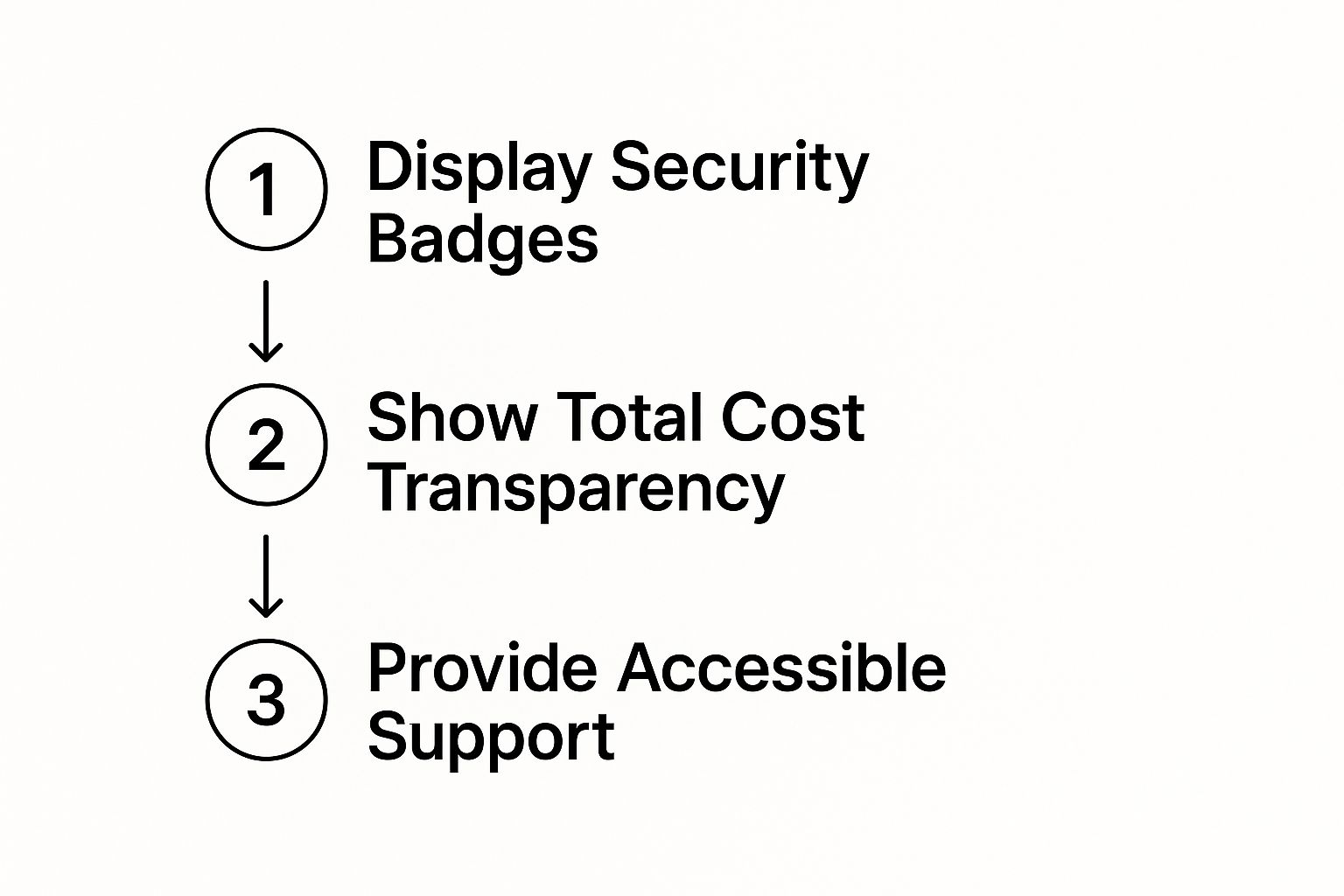
As the visual lays out, it’s a simple but powerful sequence: prove your site is secure, be honest about the costs, and be there to help if they stumble.
Placing a live chat widget or a clear link to your return policy directly on the checkout page can be the deciding factor for a hesitant buyer. It shows you’re standing by and ready to help, turning a moment of uncertainty into a confident purchase.
Win Back Lost Sales with Smart Recovery Campaigns
Let's be real: not every abandoned cart is a hard "no." More often than not, it's a "maybe later." Life happens. The dog starts barking, a work call comes through, or maybe they just needed to step away and think it over. This is exactly where a well-crafted recovery campaign can step in and turn that hesitation into a sale.
When it comes to winning back these customers, email is still king. The numbers don't lie—studies consistently show that nearly half of all abandoned cart emails get opened. Even better, over 10% of the people who click through will actually finish their purchase. Think about that. You're recovering a tenth of your lost sales with a simple, automated email.
The trick is timing. You have to act fast. If you can get that first email into their inbox within an hour, your chances of success are much higher. Wait a full day, and you've likely lost them for good. This first message isn't about a hard sell; it's just a gentle, helpful nudge.
Crafting a Winning Email Sequence
A single email is good, but a thoughtful sequence is where the magic really happens. You're not just sending reminders; you're continuing the conversation. I've found that a three-email series hits the sweet spot, often generating far more revenue than a one-and-done approach.
The first email, sent an hour after they leave, should be simple and direct. Something like, "Did you forget something?" works wonders. The key is to make it incredibly easy for them. Show them a picture of what they left behind and include a big, obvious button that takes them straight back to their pre-filled cart. No friction.
Your second email can go out 24 hours later. Here, you can gently dial up the urgency. Mentioning that an item is a bestseller or that stock is getting low can create just enough FOMO to get them to act. It's a subtle nudge that reminds them they might miss out.
If they still haven't come back after two emails, it's time for the final push. The third email, sent around the 72-hour mark, is the perfect time to offer a small incentive. This is your closer. A modest discount or a free shipping code can be all it takes to overcome that last bit of price hesitation.
This multi-step approach works because it respects the customer's journey. It keeps you on their radar without being annoying and gives them compelling reasons to return.
Here’s a blueprint you can adapt for your own abandoned cart emails. It lays out a simple but effective timeline and strategy for each message in the sequence.
Abandoned Cart Email Sequence Blueprint
| Email Timing | Subject Line Strategy | Content Focus |
|---|---|---|
| ~1 Hour Later | Friendly & Inquisitive | Gentle reminder. Showcase the product(s) with high-quality images and provide a direct link back to the cart. |
| ~24 Hours Later | Urgency or Social Proof | Re-engage by mentioning low stock, highlighting the item's popularity, or showing customer reviews. |
| ~72 Hours Later | Offer & Last Chance | Present a time-sensitive incentive, like a small discount or free shipping, to close the deal. |
This structure provides a clear path from a gentle reminder to a compelling reason to buy, effectively covering the most common reasons for abandonment.
Beyond Email: Other Recovery Channels
Email is your workhorse, but a true recovery strategy meets customers wherever they are. Not everyone lives in their inbox, so layering in other channels can seriously boost your results.
SMS Reminders: If a customer has opted into text messages, this is your most direct line of communication. SMS has massive open rates, and a quick text like, "Your cart is waiting! Click here to complete your order," is perfect for catching someone on the go. It’s immediate and hard to ignore.
Retargeting Ads: Use ad platforms like Facebook or Google to follow up visually. Seeing the exact product they almost bought show up in their social feed or on another website is a powerful reminder. It keeps your brand and that product top of mind, making it easy for them to click back and finish the job.
By combining a smart email sequence with SMS and retargeting ads, you’re creating a safety net that captures sales that would have otherwise slipped away. It’s all about turning that moment of indecision into a successful conversion.
Answering Your Top Cart Abandonment Questions
Even when you've done everything right, a few nagging questions always seem to pop up. When it comes to something as crucial as cart abandonment, getting clear answers is what helps you move from just knowing the theory to actually making changes that work.
Let's dive into a few of the most common questions I hear from e-commerce managers trying to solve this puzzle.
What's the "Perfect" Number of Checkout Steps?
Everyone wants to know the magic number, but here's the honest truth: there isn't one. The real goal isn't to hit a specific number of pages, like three or five. It's all about eliminating friction.
I’ve seen beautifully designed single-page checkouts convert like crazy, but I've also seen multi-step checkouts with a slick progress bar do just as well because they feel fast and logical.
Instead of counting pages, start counting the number of decisions and fields a customer has to tackle.
- Can you merge the billing and shipping address fields?
- Can you use smart defaults based on what you already know?
- Does the process flow naturally from one step to the next?
A great checkout feels like a single, smooth motion, not a series of annoying hurdles to jump over.
How Should We Handle International Shipping Costs?
This one is huge. With international orders, shipping costs can be all over the place, and transparency is everything. The absolute worst thing you can do is spring a massive shipping fee on a customer from another country on the very last screen. It’s a guaranteed way to lose a sale.
Here are a few tactics that work well in the real world:
- Use a Geolocation App: This is a game-changer. An app can automatically detect the shopper’s location and show a small banner with estimated shipping costs right away. You can also link to your international shipping policy from there.
- Add a Shipping Calculator: Put a simple calculator right on the cart page. Let users get an estimate before they even commit to the checkout process.
- Offer Tiered Options: Don't just give them one expensive option. Provide a range of services, from a slower (and cheaper) standard option to a premium express delivery. This puts the customer in the driver's seat, letting them balance speed and cost.
The trick is to get ahead of the shipping cost question. When a customer feels like you're being upfront and giving them control, they're far less likely to get sticker shock and bail. It’s a simple sign of respect for your global audience that builds a ton of trust.
Are Discounts the Only Way to Recover Carts?
Discounts definitely work, but they’re not your only option—and leaning on them too heavily can be a big mistake. If you fire off a coupon in every single cart recovery email, you're basically training your customers to abandon their carts just to get a deal. Over time, that will absolutely kill your profit margins.
Think of incentives as a whole toolkit, not just a single hammer.
- First Email: Start with a simple, friendly reminder. No offer needed. You’d be surprised how many people just got distracted and needed a little nudge.
- Second Email: Now, you can introduce a bit of urgency. Try a subject line like, "Your favorite item is selling fast!" or mention that stock is limited.
- Third Email: If they still haven't come back, this is the time to pull out the incentive. A modest discount or a free shipping offer can be the final push they need.
This layered approach helps you save sales without giving away revenue when you don't have to. Sometimes, a gentle reminder is all it takes.
Ready to streamline your product media workflow? AliSave Pro lets you download high-quality images and videos from AliExpress in a single click, saving you hours of manual work. Get the extension for free and build your store listings faster.