When we talk about optimizing images for the web, the goal is simple: shrink the file size as much as possible without making the picture look terrible. It's a balancing act. You achieve this by picking the right file format (like WebP), resizing your images to the exact dimensions they'll be displayed at, and then using smart compression to shave off every last kilobyte. Get this right, and your website will load faster, which keeps both your visitors and Google happy.
Why Image Optimization Is a Game Changer for E-commerce

In e-commerce, your product photos are your digital storefront. But here’s the catch: those beautiful, high-resolution images are often silent conversion killers. Every unoptimized visual adds serious weight to your page, forcing potential customers to sit and wait. Honestly, that delay is probably the single biggest reason people bounce before a site even loads.
Think of image file size as digital friction. The bigger the file, the more friction a user has to push through just to see your product. This isn't just a minor annoyance; it directly hits your store’s bottom line, causing higher bounce rates and sending frustrated shoppers straight to a faster competitor.
The Business Impact of Slow Images
For any online store, this is a big deal. But if you’re dropshipping and using the high-resolution photos your suppliers provide, the problem gets magnified tenfold. Those massive, uncompressed product shots are a lead-pipe-cinch for failing Google's Core Web Vitals, which are the key metrics Google uses to judge your site's user experience.
One of the most important of these is Largest Contentful Paint (LCP). It's just a fancy term for how long it takes for the most important thing on the page—usually a big hero image—to show up. Unoptimized images are almost always the culprit behind a bad LCP score. Google wants to see an LCP of under 2.5 seconds; anything slower, and your search rankings can take a hit.
Slow-loading pages are more than just an inconvenience; they're a direct threat to your revenue. Studies have shown that just a one-second delay in page load time can cause a 7% reduction in conversions. For an e-commerce store, that's a painful and completely avoidable loss.
Turning a Bottleneck into an Asset
By learning how to properly optimize your images, you can turn one of the most common performance bottlenecks into a powerful asset that helps you sell more. This goes way beyond just making your site feel faster. It’s about creating a smoother, more enjoyable journey for your customers from start to finish.
When you get image optimization right, you'll see a cascade of benefits:
- Better User Experience: Shoppers can flick through products seamlessly without any frustrating lag.
- Improved SEO: Faster sites get rewarded by Google with better rankings, which means more free, organic traffic.
- Higher Conversion Rates: A snappy, responsive site gives people the confidence to click "buy now."
- Lower Bounce Rates: When pages load in a blink, visitors are far more likely to stick around and see what else you have to offer.
To really see how it all fits together, think about how optimized visuals support broader ecommerce website design principles. The connection is crystal clear—fast, crisp images are foundational to a successful online store.
If you're looking for more great tips, our article on the best ecommerce website design offers more ideas for building a high-performing store. But it all starts here. Getting your product photos and variant images under control is the first, most crucial step toward building a faster, more profitable online business.
Choosing the Right Image Format for Your Products
Before you even think about resizing or compressing, your first move is picking the right image format. It’s a foundational step. Choosing the right format is like picking the right shipping box—it directly impacts size, quality, and how the image functions on your site. Get this wrong, and you're fighting an uphill battle.
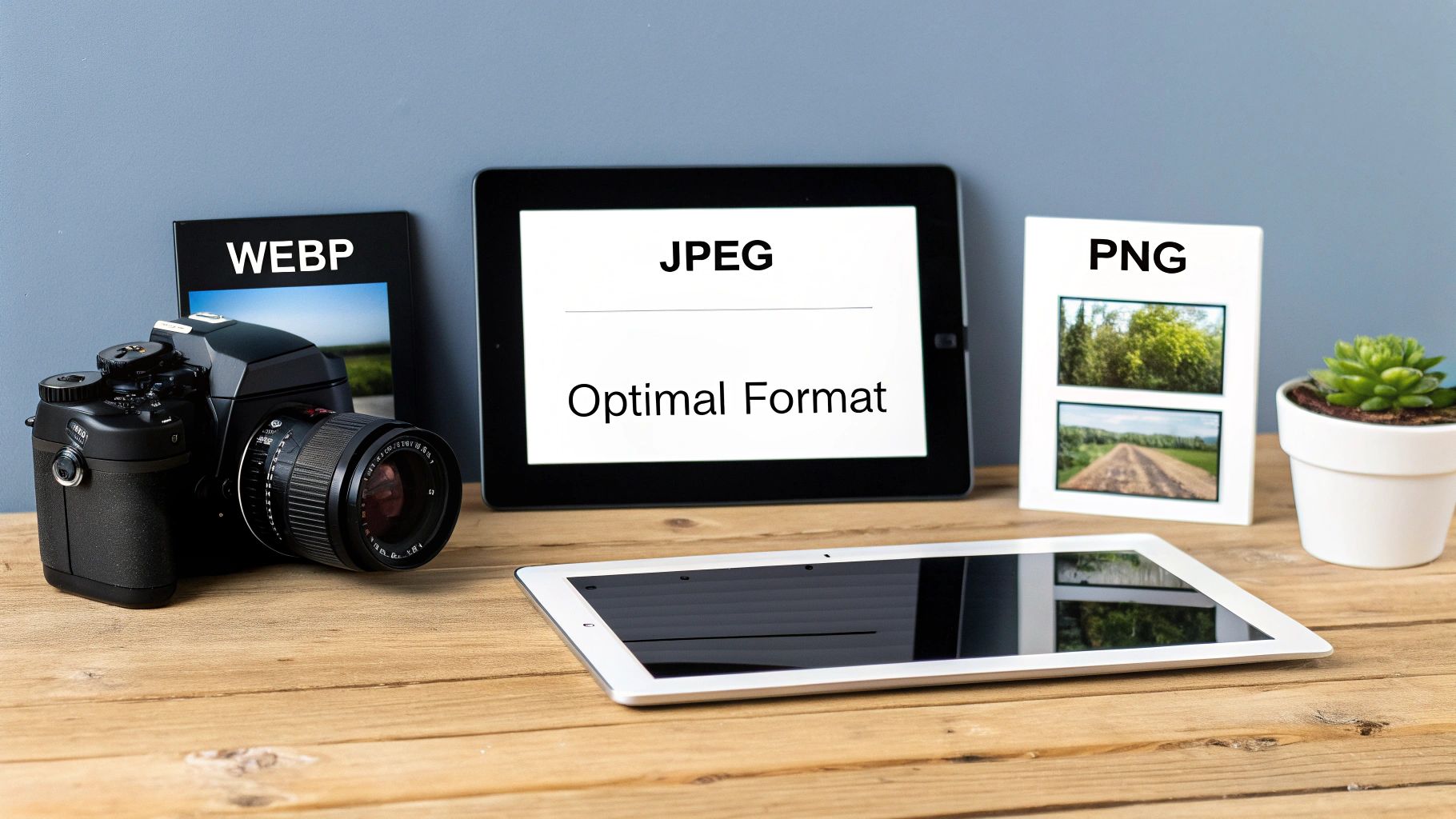
For a long time, the web basically ran on two formats: JPEG and PNG. JPEG has always been the go-to for photographs because it does a great job balancing detail and file size. PNG, on the other hand, is your guy when you need a transparent background, think logos or icons placed over a colored section of your site.
Meet the Modern Contenders: WebP and AVIF
But things have moved on. Today, we have much better options. Formats like WebP, which comes from Google, are a game-changer for most e-commerce sites. A WebP file can be 25-34% smaller than a JPEG of the same quality. Seriously. It also handles transparency, so it can often replace both JPEGs and PNGs in one fell swoop.
There's also AVIF, which can shrink files even more than WebP. Its browser support isn't quite universal yet, but it's where things are headed. Keep an eye on it.
For a dropshipping store with hundreds of product photos, switching from JPEG to WebP is one of the single most effective changes you can make. The cumulative savings in file size across your entire catalog will dramatically speed up your site and improve the shopping experience.
Making the Right Call for Your Store
So, what's the verdict? The smartest approach is to use a mix of formats, letting the specific job dictate the tool. You don’t need a one-size-fits-all rule; you need a practical strategy.
Here’s how I typically break it down for e-commerce stores:
- Product Photos: WebP should be your default. It delivers that perfect blend of crisp quality and small file size needed for all those detailed product shots.
- Logos and Icons: SVG (Scalable Vector Graphics) is king here. SVGs are tiny files that stay perfectly sharp no matter how big or small you make them. If you absolutely need a raster format, WebP or PNG are solid seconds, especially for logos with transparency.
- Promotional Banners: JPEG is still a reliable workhorse for these. It’s universally supported, which is crucial if you’re embedding those banners in emails that might be opened in older clients.
To make this even clearer, here's a quick cheat sheet comparing the most common formats you'll encounter.
Image Format Comparison for E-commerce
This table gives you a side-by-side look at the main formats, helping you decide which one fits the bill for different parts of your online store.
| Format | Best For | Key Feature | File Size |
|---|---|---|---|
| WebP | Product photos, hero images, banners | Excellent compression with high quality | Small |
| JPEG | Complex photos, max compatibility | Universal support, good for complex colors | Medium |
| PNG | Logos, icons with transparent backgrounds | Lossless quality and full transparency support | Large |
| SVG | Logos, simple icons, line art | Infinitely scalable, extremely small file sizes | Tiny |
| AVIF | All raster images (forward-looking) | The best compression currently available | Smallest |
Ultimately, choosing the right format isn't just a technical task—it's a strategic decision that pays off in faster load times and happier customers. Once you've got this foundation in place, every other optimization you do, from compression to lazy loading, will be that much more effective.
Mastering Image Compression Without Losing Quality
Alright, you've picked the right format and sized your images perfectly. Now comes the part where the real magic happens: compression. This is the single most important step for slashing your file sizes, but it’s a bit of an art form.
Go too aggressive with compression, and your beautiful product photos will look like a pixelated mess. Don't compress enough, and you’re leaving precious page speed on the table. The trick is finding that sweet spot where the file size shrinks dramatically, but the quality drop is invisible to the naked eye. To do that, you need to understand the two ways we can approach this: lossy and lossless compression.
Lossy vs. Lossless: The Two Sides of Compression
I like to think of it like packing a suitcase. Lossless compression is like meticulously rolling your clothes to fit more in. It cleverly reorganizes the image data into a smaller package without throwing anything away. When you "unzip" the file, every single pixel is perfectly intact, just as it was before.
Lossy compression, on the other hand, is like deciding you probably don't need five pairs of socks and leaving two behind. It permanently discards bits of image data that an algorithm decides are least noticeable to the human eye. This leads to much smaller file sizes, but it comes at the cost of a slight, and hopefully imperceptible, loss of detail.
For virtually all product photos on a dropshipping or e-commerce site, lossy compression is the way to go. The file size savings are just too significant to ignore, and with a moderate setting, your customers will never know the difference. Faster load times directly impact user experience and conversions.
Finding That Compression Sweet Spot
So, how much is too much? Honestly, it depends on the image. A photo with intricate details and a wide range of colors can often handle more compression than a simple graphic with large areas of flat color. A good starting point is to ensure your original image is as high-quality as possible. Using the best free AI image upscaler tools can enhance resolution before you even start, giving you a better canvas to work with.
Your best bet is to use a tool that shows you a live preview. Playing with a slider and seeing the result in real-time makes it easy to find the right balance. Here are a few of my go-to tools:
- TinyPNG / TinyJPG: A dead-simple classic. You just drag and drop your images, and its smart algorithm finds a great balance for you. It's my first stop for quick optimizations.
- ImageOptim: This is a fantastic free app for Mac users. It gives you more control over the settings and also strips out hidden data (like camera info) from the files to save even more space.
- Squoosh: A powerful, browser-based tool from Google. Its best feature is a side-by-side slider that lets you compare the "before" and "after" in real-time as you tweak the compression level.
Think about the impact. A crisp product photo might start at 2 MB straight from the camera. After resizing it for a product page, it might be down to 450 KB. With a good lossy compression tool, you can often get that same image well under 100 KB without anyone noticing. That’s a huge win for your site's performance.
Responsive Images and Lazy Loading: The One-Two Punch for Performance
Your customers are everywhere. They're on giant desktop monitors, sleek tablets, and tiny phone screens. One of the single biggest performance mistakes I see is serving the exact same massive product image to every single person. Forcing a smartphone to download a file built for a 27-inch monitor is a surefire way to waste their data and kill your load time.
This is where responsive images save the day. Instead of a "one-size-fits-all" approach, you give the browser a whole menu of image sizes to choose from. The browser then acts like a smart waiter, picking the perfect option for whatever device your customer is using.
Use Srcset to Serve the Right Size, Every Time
The workhorse behind responsive images is the srcset attribute. It looks a bit technical at first glance, but it's really just a simple instruction for the browser. You're basically saying, "Hey, here are a few different versions of this picture. Grab the one that makes the most sense."
Here’s what that looks like in the code:<img src="product-medium.jpg" srcset="product-small.jpg 500w, product-medium.jpg 1000w, product-large.jpg 1500w" alt="A cool product">
Let's break that down:
src: This is your fallback. Any ancient browser that doesn't getsrcsetwill just load this one.srcset: This is the list of options. Each file is paired with its actual width (the500wmeans the image is 500 pixels wide). The browser then does the math based on the user's screen resolution and size to pick the most efficient file.
The good news? If you're on a platform like Shopify, it often handles generating srcset automatically for your product images. Your job is to make sure you upload a high-quality source image so it has good material to work with when it creates those smaller versions.
Defer Off-Screen Images with Lazy Loading
Now for the second part of our performance combo: lazy loading.
Picture a long product page with 30 different images, from the main gallery to customer-submitted photos at the bottom. Without lazy loading, a browser will try to download all of them the second the page loads. It doesn't care that most of them are way "below the fold" where the user can't even see them yet.
Lazy loading completely flips that on its head. It instructs the browser to only load the images currently in the user's viewport. As they scroll down, new images load just in time.
This one change can have a massive impact on your initial page load speed. By not loading images a user may never even scroll to, you shrink the initial download size and let the critical, above-the-fold content pop into view much faster. This is a direct win for Core Web Vitals like First Contentful Paint (FCP) and Largest Contentful Paint (LCP).
And the best part? Implementing it is incredibly easy these days. You just add loading="lazy" right into the image tag:<img src="product-photo.jpg" loading="lazy" alt="Another cool product">
All modern browsers know exactly what to do with that. Platforms like Shopify and WooCommerce often have a simple checkbox in the theme settings to enable lazy loading across your store, or you can find a dedicated performance app to do the job.
When you combine srcset with lazy loading, you get a site that's not just fast, but also incredibly efficient, no matter how or where your customers are shopping.
Automating Your Image Optimization Workflow
Let's be honest: manually optimizing every single product photo is a nightmare. If you're managing dozens, or even hundreds, of listings, it's just not sustainable. The real secret to scaling your store isn't just knowing the theory of image optimization; it's building a smart, automated workflow that handles the grunt work for you. This is how you reclaim hours of your time and guarantee every image on your site is perfectly optimized, every single time.
A truly efficient process covers everything, from the moment you source your product photos to the final upload onto your e-commerce platform. When you systemize this, every new product you add is already set up for top speed and SEO performance from day one. It’s about building a scalable foundation for growth.
Building Your Automated Process
The whole point is to create a simple, repeatable sequence that you barely have to touch. A solid workflow for a dropshipping store usually breaks down like this:
Start with Great Source Material: Always begin with the best quality images you can find. For dropshippers, that usually means grabbing high-resolution product shots, variant images, and even customer review photos straight from your supplier's page.
Automate the Downloads: Forget right-clicking and saving images one by one. Use a tool that can scrape and download all the media for a product in a single click. This step alone is a massive time-saver and helps keep your project files organized right from the get-go. We actually have a great guide on how to download images from websites that walks you through this.
Process Images in Bulk: Once you have the raw files, feed them directly into an optimization service that handles batch processing. The best tools will automatically compress them and convert them into a next-gen format like WebP without you needing to do anything.
Upload the Final Assets: The last step is to upload your newly optimized, web-ready images straight to your Shopify or WooCommerce store.
This whole process ensures your site can intelligently serve the right-sized image to the right device, which is the core principle of responsive design.
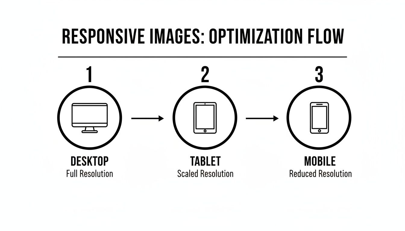
This flowchart really drives home why creating multiple image sizes is so important—a task that automation makes effortless.
Don’t underestimate the financial impact here. Way back in 2012, Walmart discovered a 2% conversion increase for every one-second improvement in their load time, much of which was driven by image optimization. Fast forward to today, and images regularly make up over 50% of a webpage's total weight. They are often the single biggest reason for a poor Largest Contentful Paint (LCP) score.
By using a tool like AliSave Pro to automatically grab and compress AliExpress photos into WebP or AVIF formats—which can slash file sizes by 40-60%—you’re directly addressing this. You’ll be well on your way to hitting Google's Core Web Vitals targets and sidestepping the high bounce rates that kill unoptimized sites.
Key Takeaway: An automated workflow isn't just a nice-to-have; it's essential for any serious e-commerce store. It turns a boring, manual chore into a seamless system that directly boosts your site's performance and, ultimately, your revenue.
Common Questions About Image Optimization
Even with a solid workflow, you're bound to run into some specific questions. The world of web performance is full of little details, and figuring out how to handle common scenarios will save you a ton of headaches down the road. This section covers the questions we hear most often from e-commerce sellers trying to master image optimization.
Think of this as your go-to troubleshooting guide. We'll give you clear, direct answers to help you polish your strategy, solve those annoying issues, and make sure your product catalog is as fast and beautiful as it can be.
What Are the Ideal Image Dimensions for an E-commerce Site?
This is the big one, and the honest-to-goodness answer is: it depends on your website's theme. There's no magic, one-size-fits-all number. Your theme’s layout is what determines the largest possible width your images will ever need to be. Your job is to find that number and use it as your benchmark.
A quick and easy way to figure this out is with your browser's developer tools. Just right-click on a main product image on your live site and hit "Inspect." When you hover over the image's code, your browser will show you the exact dimensions it's being displayed at.
Pro Tip: You'll want to resize your images to be a bit larger than their maximum display size so they look crisp on high-resolution "Retina" screens. A good rule of thumb is to save them at 1.5x to 2x the largest display width. So, if your theme shows product images at 800 pixels wide, saving them somewhere between 1200 and 1600 pixels wide is a great strategy.
Should I Optimize Images Before or After Uploading Them?
You should absolutely, 100% optimize your images before you upload them to your store.
Trying to upload a massive 5 MB photo and letting a plugin on your server do all the heavy lifting is asking for trouble. It chews up server resources, the process can sometimes fail, and it clutters your media library with huge original files you don't need.
A much smarter workflow looks like this:
- Resize and crop the images on your computer first.
- Run those resized images through a compression tool like TinyPNG or Squoosh.
- Upload the final, lightweight WebP or JPEG files to your store.
Doing the work upfront means every single file that hits your server is already lean and ready to go. It gives you total control over the end result.
Can I Bulk Optimize All the Images Already on My Site?
Yes, you can, and for any established store, it's a fantastic idea. If you’re sitting on hundreds or thousands of unoptimized images that are dragging your site down, going back one-by-one just isn't realistic. This is where bulk optimization tools are absolute lifesavers.
Most platforms have apps or plugins built for exactly this.
- For WordPress/WooCommerce, tools like ShortPixel or Imagify can scan your entire media library and crush every image automatically.
- Shopify has plenty of similar apps available in its App Store.
These tools are critical for bringing an older site up to modern performance standards. As we cover in our guide on how to Outrank SEO, site speed is a huge ranking factor, and images are often the biggest culprit holding you back.
Will Using WebP Images Hurt My SEO if a Browser Doesn't Support It?
Nope, it won't hurt your SEO one bit, as long as you do it right. Modern web development doesn't just throw a WebP file at every browser and hope for the best. Instead, we use fallbacks.
This means your website's code first tries to serve the super-efficient WebP file. If the user is on an ancient browser that can't handle it, the code automatically serves a standard JPEG or PNG file instead. Everyone sees a working image, and the vast majority of your visitors get the faster experience. It’s the best of both worlds—maximum compatibility without sacrificing performance.
Ready to stop wasting time manually saving product photos? AliSave Pro is the ultimate tool for dropshippers, letting you download all AliExpress product images, videos, and variant photos in a single click. Create a streamlined, automated workflow that gets your products to market faster. Get the free Chrome extension at https://alisavepro.com and see the difference.