
Boosting your ecommerce conversion rate isn't about some secret trick; it's about methodically building a shopping experience that feels seamless, trustworthy, and intuitive. You're turning casual browsers into confident buyers by focusing on what truly matters: site speed, clear navigation, compelling visuals, and powerful trust signals.
Build a High-Converting Ecommerce Foundation
Before you start A/B testing button colors or writing clever copy, you have to get the basics right. Your website's foundation is everything. These core elements are what separate the stores that thrive from the ones that fizzle out.
Think of your website like a brick-and-mortar shop. If the front door sticks (slow load times), the aisles are a confusing mess (poor navigation), and the product displays are dark and unappealing (bad photos), people will walk right out. The same is true online, except your customers have even less patience.
Slash Page Load Times to Retain Visitors
A slow website is the fastest way to lose a sale. We’ve all been there—clicking a link and staring at a blank screen. Most people won't wait. They’ll just hit the back button and go to a competitor.
Fighting lag is a technical battle, but it’s one you can win. Here’s where to focus:
- Compress Your Images: High-resolution photos are a must, but they can be huge files. Use tools to shrink their size without sacrificing quality. It makes a massive difference.
- Minimize Your Code: Every app, plugin, and custom script adds weight to your site. Do a regular audit. If you’re not using something, or if it’s slowing you down, get rid of it.
- Use a Content Delivery Network (CDN): A CDN is like having mini-versions of your site stored on servers all over the world. This means your international customers get the same speedy experience as your local ones.
A delay of just 100 milliseconds in load time can hurt conversion rates by 7%. It’s a stark reminder that every single millisecond counts when you’re trying to keep a potential customer engaged.
Create Intuitive Site Navigation
It sounds obvious, but if people can't find what they're looking for, they can't buy it. Your goal should be to make navigation so simple that a first-time visitor can find any product category in a couple of clicks. Confusion creates friction, and friction kills conversions.
Organize your products into logical categories. Use plain language that your customers would actually use, not industry jargon. A prominent, powerful search bar with filters and autocomplete is also non-negotiable, especially if you have a lot of products. Getting these things right from the beginning is a huge advantage, as we cover in our guide on how to start dropshipping.
The Importance of High-Quality Visuals
In ecommerce, your product photos are your sales pitch. Customers can't touch, feel, or try on your products, so your visuals have to do all the heavy lifting. Grainy, poorly lit, or generic photos scream untrustworthy and make your products look cheap.
Invest in professional-quality photography that shows your items from every important angle. Don't forget lifestyle shots—showing your product in a real-world context helps customers imagine themselves using it.
Before we move on, let's quickly recap how these foundational elements directly influence your store's performance. Getting these right is the first and most important step.
Core Website Elements and Their Conversion Impact
| Core Element | Primary Goal | Impact on Conversions |
|---|---|---|
| Site Speed | Reduce friction and bounce rates | Faster load times directly correlate with higher conversion rates and better SEO rankings. |
| Navigation | Help users find products easily | Clear menus and search functionality reduce user frustration and increase the likelihood of a sale. |
| Visuals | Build desire and trust | High-quality images and videos bridge the gap of not seeing the product in person, boosting confidence. |
Ultimately, nailing these fundamentals is what separates the average stores from the top performers. While industry benchmarks show a typical ecommerce conversion rate hovering around 2-3% worldwide, leading brands often hit 3-5% or more. They aren’t using magic; they’ve just mastered the basics of creating a fast, clear, and trustworthy experience for their customers. As you can find in these ecommerce conversion rate benchmarks at Blend Commerce, a solid foundation is your launchpad for growth.
Build Unbreakable Customer Trust

You can have the most beautiful design and a lightning-fast site, but none of it matters if shoppers get spooked before entering their credit card details. In e-commerce, trust is the invisible currency that fuels every single sale. Without it, even the most interested visitor will hit the back button.
Building that trust isn’t about just slapping a security badge in your footer and calling it a day. It’s about weaving authenticity and reliability into every single touchpoint, turning a shopper's natural skepticism into genuine confidence. It’s about proving there are real, passionate people behind your products.
Let Your Customers Do the Selling for You
One of the quickest ways to build trust is to let your happy customers speak for you. We’re wired to look at what others are doing to guide our own decisions—a concept known as social proof. It's a powerful psychological shortcut.
But let's be honest, those generic, text-only testimonials just don't cut it anymore. Today's shoppers can smell a fake review from a mile away. You need to show them raw, unfiltered proof that your product actually works.
- Go Beyond Text with Photo & Video Reviews: Seeing a product in someone's home, in their hands, is infinitely more persuasive than a sterile studio shot. Try offering a small discount on a future order for customers who submit a photo or a quick video with their review.
- Feature User-Generated Content (UGC): Actively look for customers posting about you on social media and—with their permission—feature those posts on your site. This creates a fantastic feedback loop that encourages others to share their own experiences.
- Place Review Snippets Where They Matter: Don't just bury all your reviews at the bottom of the page. Pull out the most compelling quotes and sprinkle them right next to your "Add to Cart" button. A snippet like "This is the only thing that cleared up my skin in two weeks!" offers powerful reassurance at the exact moment a customer is deciding whether to buy.
When shoppers see visual proof from people just like them, they’re far more willing to take a chance on a new brand. It makes the purchase feel less like a gamble and more like a safe bet.
Share Your Story with a Real "About Us" Page
So many brands treat their "About Us" page like a throwaway, filling it with bland corporate-speak. This is a massive missed opportunity. Your "About Us" page is your chance to tell your story, make a human connection, and show you're more than just a faceless website.
A great "About Us" page doesn’t just list what you do; it explains why you do it. Talk about the problem you wanted to solve when you started. Introduce your team with real photos—not stock images. Share the values that drive your business forward.
This kind of storytelling transforms your brand from a simple place to buy things into a mission people can get behind and support. That connection is the bedrock of long-term loyalty and trust.
Be Radically Transparent with Your Policies
Nothing kills trust faster than a surprise shipping fee or a convoluted return policy. The second a customer feels like they've been tricked, they’re gone for good. If you're serious about figuring out how to improve ecommerce conversion rates, transparency isn't optional.
Your shipping costs and delivery windows need to be obvious long before a customer gets to the final checkout screen. Smart stores often show this right on the product page or in the mini-cart. The same goes for your return policy—don't make people hunt for it.
A simple, easy-to-find return policy dramatically lowers the perceived risk for a first-time buyer. Placing clear microcopy like "30-Day Hassle-Free Returns" right under your call-to-action buttons can be enough to eliminate that last-minute hesitation, making the purchase feel safe and easily reversible.
Design Product Pages That Persuade and Sell
This is it. The product page is your final sales pitch—the moment a casual browser decides to become a paying customer. A weak page can kill a sale on the spot, completely wasting all the effort you put into ads and homepage design.
Think of your product page as your store's best salesperson. It needs to work 24/7, answering questions, building excitement, and making it incredibly easy for someone to say "yes." This is where the rubber meets the road when you’re figuring out how to improve ecommerce conversion rates.
Focus on Benefits, Not Just Features
Here’s a classic marketing mistake I see all the time: sellers get so caught up in what their product is that they forget to explain why someone should care. A dry list of technical specs doesn't sell. Solutions do.
Instead of just saying a backpack has "water-resistant nylon," you need to paint a picture. Try this: "Caught in a sudden downpour? Your laptop and valuables stay bone dry, safe inside our premium water-resistant pack." See the difference? You’ve shifted from a feature to a direct benefit, and that’s what truly connects with a buyer.
A great product page anticipates a customer's unspoken questions and answers them with clear, benefit-driven language. It doesn’t just describe the item; it demonstrates its value in the customer's life.
Let Shoppers Virtually “Touch” Your Product
Online, you have one major disadvantage: customers can't pick up, feel, or try on your product. That's why your visuals have to do all the heavy lifting. High-quality, dynamic imagery isn't just nice to have; it's non-negotiable.
Don't cut corners here. A comprehensive visual strategy bridges the gap between the screen and reality. Here’s what works:
- High-Resolution Images: Show your product from every single angle. A good zoom function is crucial so shoppers can inspect the little details—the texture, the stitching, the finish.
- Lifestyle Photos: Don't just show the product on a white background. Show it being used in the real world. This helps customers visualize it in their own lives, making the purchase feel more real and less abstract.
- Short Demo Videos: A quick 30-second video can often do more than ten photos combined. Show the product in action, highlight its key functions, and prove how easy it is to use.
- 360-Degree Views: This is the closest you can get to putting the product in their hands. It gives shoppers a sense of control and a complete understanding of its shape and design.
These elements build confidence and erase the doubt that kills conversions. When sourcing high-quality media, exploring various product sourcing tools can be a huge time-saver.
Make the Path to Purchase Obvious
Okay, you've convinced them. They want it. Now, don't make them work to give you their money. The "Add to Cart" button needs to be the most obvious thing on the page. Use a bold, contrasting color and clear, direct text. No one should ever have to search for it.
Price can be a major hurdle, so tackle it head-on. By displaying logos for "buy now, pay later" services like Afterpay or Klarna right next to the price, you reframe the cost. Suddenly, a $200 purchase becomes four easy payments of $50, which feels much more manageable.
A little urgency can also work wonders. Simple alerts like "Only 3 left in stock!" tap into a customer's fear of missing out (FOMO) and can be just the push they need to stop procrastinating and click "buy."
It also helps to know where you stand. As of 2025, the average eCommerce conversion rate hovers between 2% and 4%, but this varies wildly. Personal care products can see rates around 6.8%, while home decor might only get 1.4%. These benchmarks show just how much your strategy needs to be tailored to what you sell. You can discover more insights about these eCommerce conversion rate variations on networksolutions.com.
Eliminate Friction in Your Checkout Process
You’ve done all the hard work. You built trust, created a compelling product page, and guided your shopper to click "Add to Cart." This is the moment of truth, but it’s also where an incredible number of sales simply fall apart. The checkout is the final hurdle, and any friction—be it confusion, surprise costs, or unnecessary steps—can send a motivated buyer straight for the exit.
A clunky, multi-page checkout feels like a chore. The goal is to make it so seamless and effortless that customers glide right through to the confirmation page. If you're serious about boosting your e-commerce conversion rates, streamlining this final step is one of the highest-impact changes you can make.
Offer a Guest Checkout Option
Forcing someone to create an account before they can buy anything is a classic conversion killer. It throws up a major roadblock right when their buying momentum is at its peak. Let’s be honest, most shoppers don’t want to remember another password or sign up for yet another account; they just want to complete their purchase.
By offering a prominent guest checkout option, you remove this barrier entirely. You can always give them the chance to create an account after the purchase is complete, using the information they’ve already provided. It’s a small change that respects your customer's time and can dramatically cut down on cart abandonment.
This infographic breaks down a few keys to a smoother checkout.
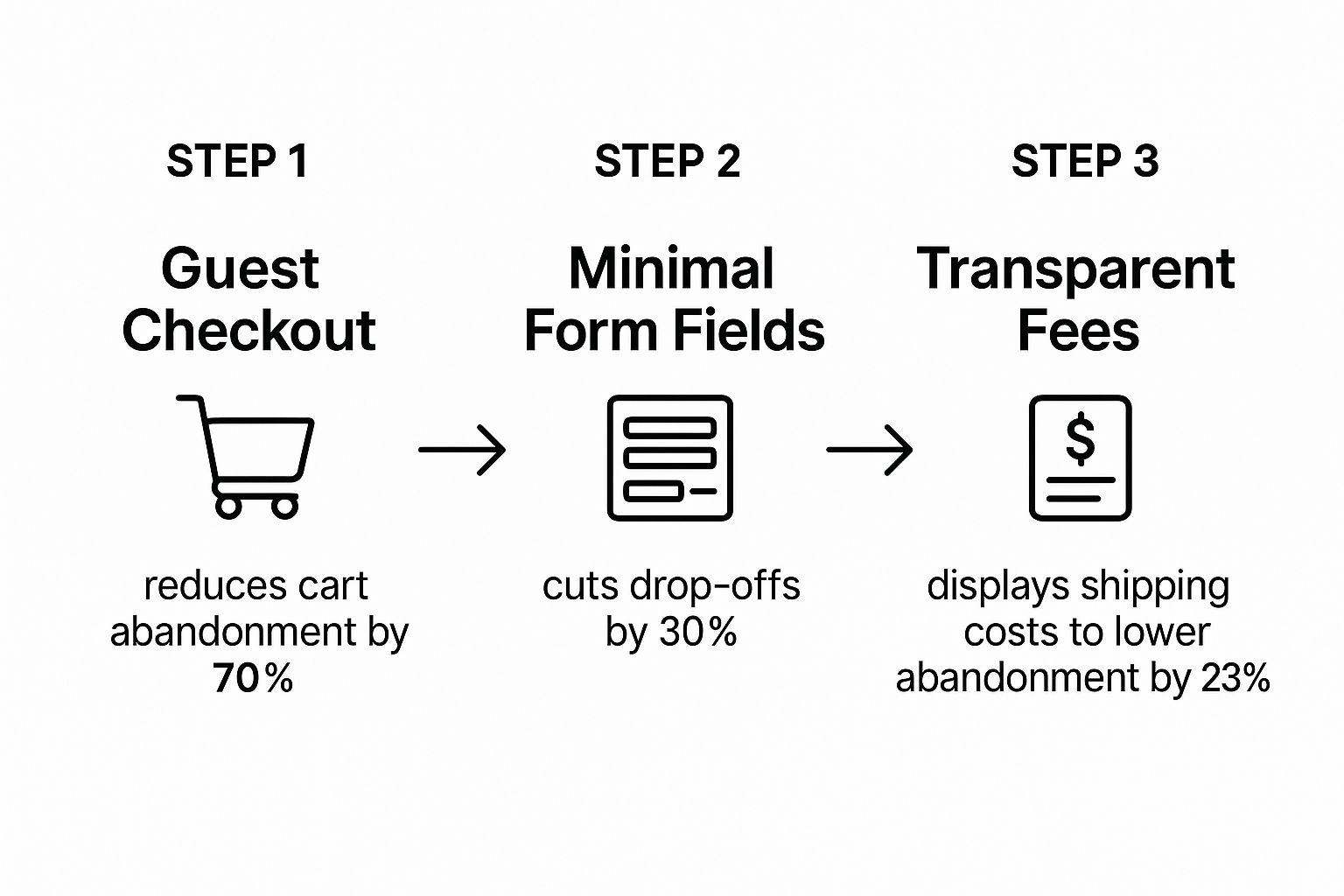
As you can see, every step you take to simplify the process—from allowing guest access to being upfront about costs—has a real impact on keeping customers on the path to purchase.
Minimize Form Fields to the Essentials
Every single field you ask a customer to fill out is another chance for them to second-guess their purchase or just give up. Do you really need their middle name, a second address line, or their phone number if you aren't using it for delivery updates? Probably not.
It’s time to audit your checkout form with a critical eye. Cut it down to the absolute bare minimum required to process the order: name, shipping address, email, and payment details. That's it.
Here are a few ways to make it even easier:
- Enable Autofill: Let the browser do the heavy lifting by enabling autofill for addresses and payment information.
- Use a Single Name Field: Instead of separate "First Name" and "Last Name" fields, try using a single "Full Name" field.
- Add a Simple Checkbox: Default to the billing address being the same as the shipping address. A simple checkbox is all they need if it’s different.
These small tweaks reduce the mental effort required from the shopper, making the whole process feel faster and less intrusive.
Be Radically Transparent About Costs
The number one reason for cart abandonment, by a long shot, is unexpected costs. When a customer starts the checkout, they have a price in their head. If the final total is suddenly inflated by high shipping fees or surprise taxes, it feels like a bait-and-switch.
This is where so many stores lose the sale. The fix is simple: transparency.
Key Takeaway: Show estimated shipping and taxes directly in the cart, long before the final payment screen. Use a zip code estimator or display clear shipping rate tiers. Sticker shock is a conversion killer; eliminating it builds trust and keeps the customer moving forward.
Here’s a great example from Target, which shows a clear order summary with all costs itemized right from the cart page.
By showing estimated shipping and taxes upfront, Target effectively manages customer expectations and prevents nasty surprises at the final step.
This issue is especially painful on mobile. The data shows that while 73% of e-commerce traffic comes from mobile, the conversion rate is only 2.9%, a stark contrast to 4.8% on desktop. This gap is often due to a clunky mobile checkout where surprise fees are even more jarring on a small screen.
With the global cart abandonment rate hitting over 70% (and even higher on mobile), being upfront about all costs isn't just nice—it's a critical strategy. You can explore more benchmarks about e-commerce conversion rates on SpeedCommerce to dig deeper into these device-specific challenges.
Finally, you need to create a feeling of security. Display trust seals and payment logos prominently right where users enter their card details. Seeing familiar logos like Visa, Mastercard, and PayPal provides last-minute reassurance that their information is safe. Combine this with a visual progress bar (e.g., Shipping > Payment > Review), and you create a checkout experience that isn’t just smooth but also psychologically comforting.
Use Data to Test and Personalize the Experience
https://www.youtube.com/embed/eiIhTbFP0ls
The most successful e-commerce stores I’ve seen all have one thing in common: they don't guess, they test. They treat their website not as a static brochure but as a living, breathing experiment that's constantly being tweaked and improved based on what real users are doing. Making data-driven decisions is the bridge between a good store and a truly great one.
This is where you graduate from assumptions to certainty. You might feel like a green "Buy Now" button looks better, but the data might come back and show you a red one actually converts 15% higher. This cycle of continuous improvement is the only way to figure out how to improve ecommerce conversion rates sustainably.
Start with Smart A/B Testing
A/B testing, also known as split testing, is simply comparing two versions of a webpage to see which one performs better. It's a straightforward concept that delivers powerful results. You show one version (the control, or 'A') to half your audience and a second version with a single change (the variation, or 'B') to the other half.
The golden rule here is to change only one element at a time. If you change the headline, the button color, and the main image all at once, you’ll have no clue which change actually moved the needle.
Zero in on your highest-impact pages first—your homepage, key product pages, and the checkout flow. Here are a few simple but effective elements you can start testing right away:
- Headlines: Pit a benefit-driven headline against one that's more focused on a feature.
- Call-to-Action (CTA) Button: Experiment with the text ("Add to Cart" vs. "Buy Now"), color, and size.
- Product Images: Try using a lifestyle photo as the main image versus a standard product-on-white shot.
- Page Layout: Test a single-column layout against a two-column design on your product pages.
The process is disciplined: identify a problem (like a low add-to-cart rate), form a hypothesis ("I believe changing the CTA button to orange will increase clicks"), run the test, and analyze the results. This structured approach takes the guesswork out of growth.
Dive Deep into Your Analytics
Your website analytics platform, like Google Analytics, is a goldmine of information. It tells you exactly where you’re losing customers. Before you can even form a good hypothesis for an A/B test, you need to know where the leaks are in your conversion funnel.
Look for pages with unusually high exit rates. If thousands of people land on a specific product page but most of them leave without clicking anything else, you’ve just found a major problem area. Is the price unclear? Are the images low-quality? Is the description confusing? Your analytics point you to the "where," so you can start investigating the "why."
Don't just glance at the overall conversion rate. You have to segment your data. How do mobile users convert compared to desktop users? How do visitors from your email campaigns perform versus those from social media ads? These insights tell you where to focus your optimization efforts for the biggest wins.
Harness the Power of Personalization
Today’s shoppers don't just want a generic experience; they’ve come to expect a personal one. They want to feel like your store was built just for them. Personalization uses visitor data—like their browsing history, past purchases, and even location—to show them the most relevant content and products.
When it’s done right, it's incredibly effective. It makes shoppers feel understood and guides them toward products they are genuinely likely to love. This creates a smoother, more enjoyable journey that naturally leads to more sales.
Here are a few practical ways you can start personalizing the experience:
| Personalization Tactic | How It Works | Impact on Conversions |
|---|---|---|
| Product Recommendations | Show "Frequently Bought Together" or "You Might Also Like" sections based on the current product or a user's past behavior. | Increases Average Order Value (AOV) and helps customers discover more of your catalog. |
| Dynamic Content | Change homepage banners or offers based on a visitor's location, how they got to your site, or their purchase history. | Makes the site feel immediately relevant and tailored to that individual shopper's interests. |
| Personalized Emails | Send cart abandonment emails that feature the exact products left behind, or post-purchase follow-ups with related items. | Recovers sales you would have lost and encourages repeat business by staying top-of-mind. |
Putting these strategies into practice can feel complex, but many platforms now offer user-friendly apps and integrations to handle the heavy lifting. For stores built on a dropshipping model, leveraging various dropshipping automation tools can help manage personalized follow-ups and product recommendations more efficiently, saving you time while boosting your revenue.
Frequently Asked Questions About Ecommerce Conversion Rates
As you dive into optimizing your store, you'll find certain questions pop up over and over. Getting straight answers helps you put your energy where it'll actually move the needle. Let's walk through some of the most common questions I hear from store owners trying to boost their conversion rates.
This isn't about chasing vanity metrics; it’s about understanding what truly drives growth and making smart, consistent improvements.
What’s a Good Ecommerce Conversion Rate to Aim For?
Globally, a solid target to shoot for is somewhere between 2% and 4%. But honestly, that number can be all over the map depending on what you're selling. A personal care brand, for instance, might hit conversion rates above 6%, while a high-end home decor store could be doing great at 1.5%.
The price of your product and how long it takes a customer to decide are huge factors here. Instead of getting hung up on an industry-wide average, your real mission should be to continuously improve your own baseline.
A "good" conversion rate is one that’s better than last month's. Focus on beating your own benchmarks through relentless testing and refinement, not on hitting some generic industry number.
This mindset keeps you focused on what you can control and ensures you're always making progress.
I Want to Improve My Conversion Rate. Where Do I Even Start?
It’s easy to feel paralyzed by all the things you could do. The trick is to start with the changes that will give you the most bang for your buck and build some early momentum.
Your first move? Dive into your analytics and find out where people are bailing. More often than not, the biggest leaks are in the checkout process.
- Nail Your Checkout: This should be your number one priority. Let people check out as guests, get rid of any form fields that aren't absolutely essential, and show all costs (like shipping and taxes) upfront. No surprises.
- Beef Up Your Product Pages: At the same time, make sure your product pages are doing the heavy lifting. We're talking crisp, high-quality images from every angle and clear, compelling descriptions that explain how your product solves a problem.
Focusing on these two core areas almost always delivers the fastest and most significant wins.
How Long Does It Take to Actually See Results?
The timeline for seeing a real difference depends entirely on the changes you're making. You're not going to double your sales overnight, but you can see progress a lot faster than you might think.
Small, simple adjustments—like changing the color of your "Add to Cart" button or making your shipping costs crystal clear on the product page—can show a measurable lift in just a few days with a simple A/B test.
Bigger projects, like a full website redesign or a deep dive into personalization, might take a few months to properly implement and measure. The key is to embrace a mindset of constant improvement. Just keep testing, learning, and making things a little bit better every day.
A huge part of earning that conversion is showing off your products with stunning, high-quality visuals that build trust. AliSave Pro is a game-changer here, letting you download all product photos, variant images, and videos from any AliExpress page with one click. Get your products looking their best and ready to sell in a fraction of the time. Download the free AliSave Pro extension today.